

SecOps Dashboard
Introduction
In the platform, the SecOps Executive Dashboard shows vulnerability and threat data in a graphical format for various accounts.
This user guide will focus on the SecOps Executive Dashboard, and how users can leverage it to understand their cloud security and visualize relevant data in meaningful ways.
SecOps Executive Dashboard Overview
The dashboard is divided into the following sections:
- Vulnerability Insights:
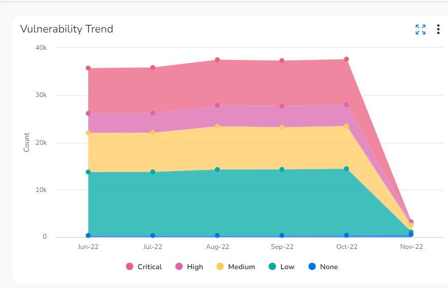
- Vulnerability Trend: This graph shows the count of vulnerabilities and severities detected over the past six months.
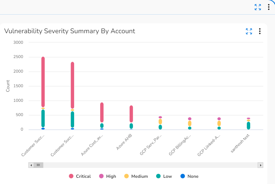
- Vulnerability Severity Summary by Accounts: This graph shows the trends in vulnerability count and severity count for different accounts. The severity is divided into these categories: critical, high, medium, low, and none.
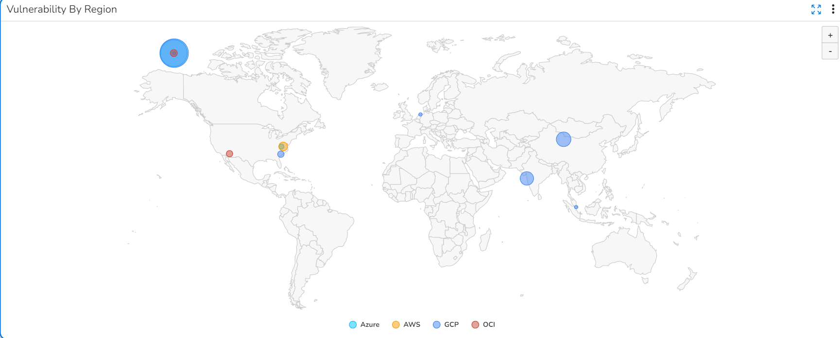
- Vulnerability by Region: This map shows the vulnerability count per geographic region.
- Threats:
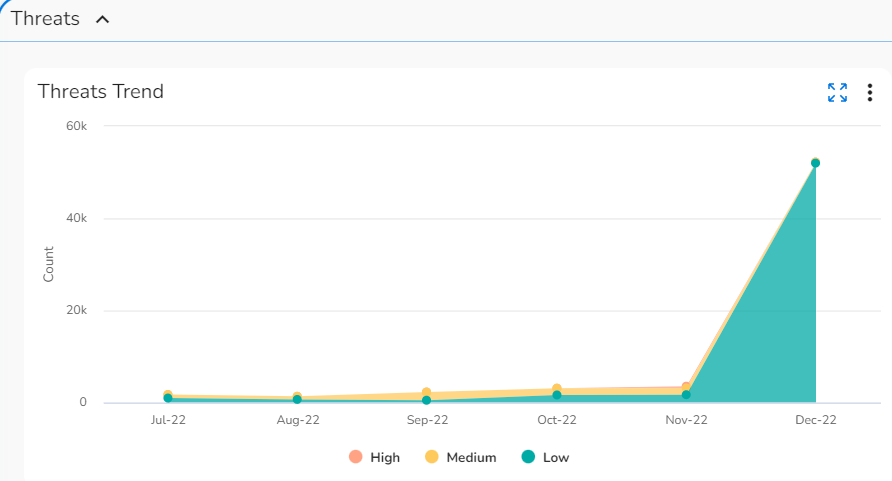
- Threats Trend: This graph shows the threat counts and their severity levels for the past six months.
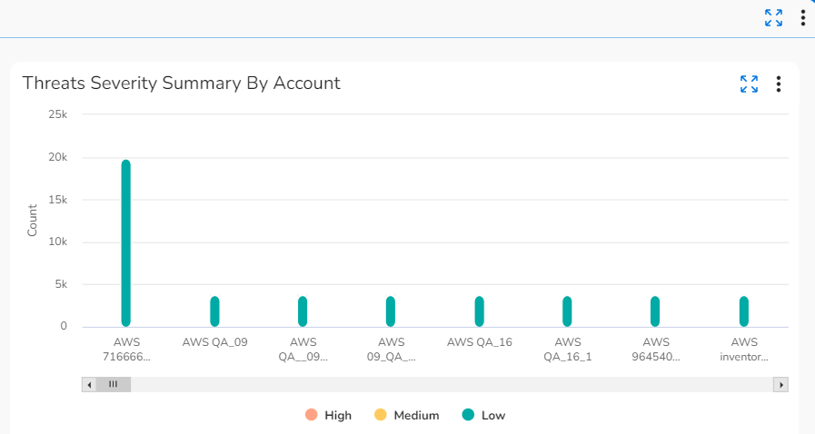
- Threats Severity Summary By Account: This graph shows the trends in threat count and severity count for different accounts. The severity is divided into high, medium, and low categories.
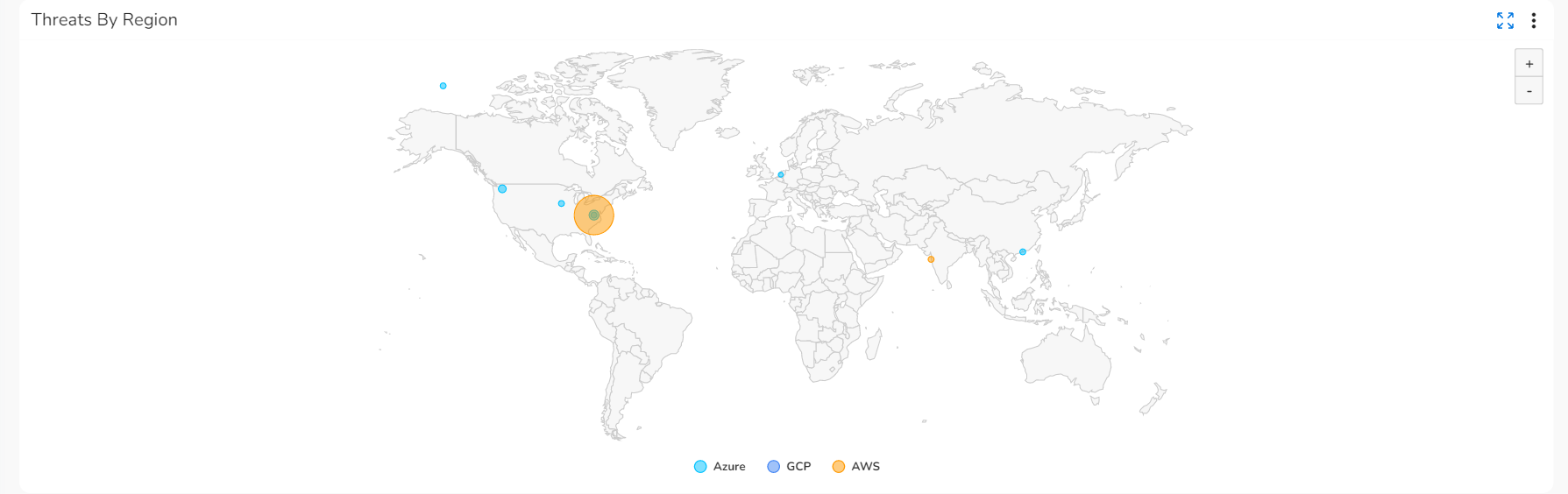
- Threats By Region: This map shows the threat count per geographic region.
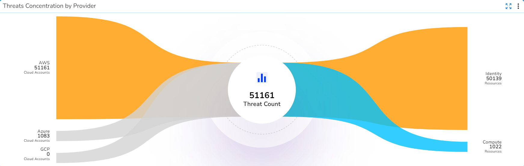
- Threats Concentration by Provider: This chart shows the threat count for the current month as per the cloud providers and cloud resources.
- Config Violations:
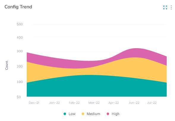
- Config Violations Trend: This widget shows the severity count of config violations for the past six months. Severity can be low, high, or medium. Users can also view the total count of config violations here.
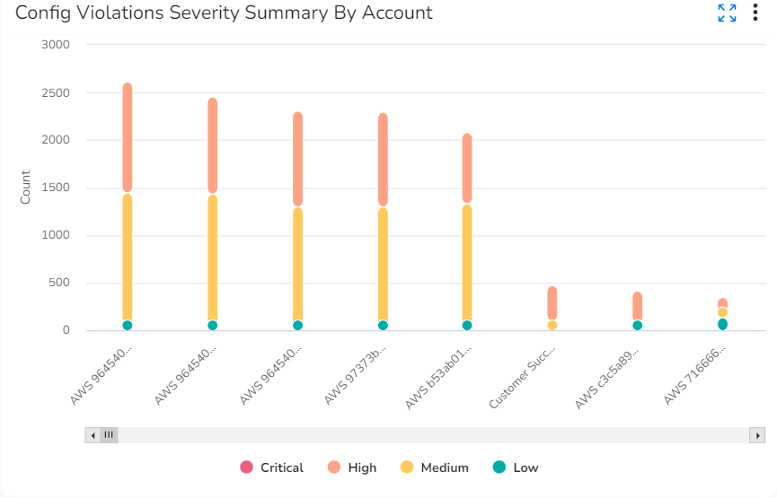
- Config Violations Severity Summary By Account: This widget shows the account-wise config violation count and severity count for the current month.
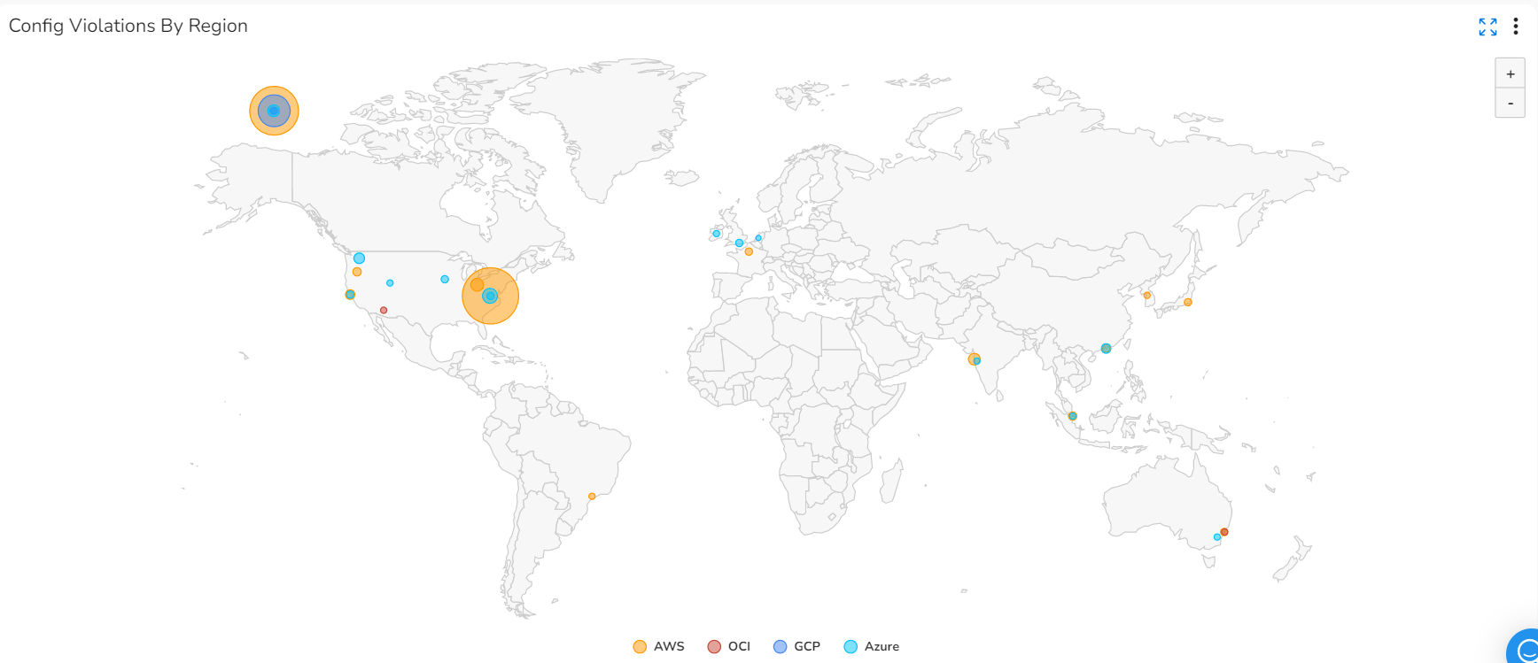
- Config Violation by Region: This widget shows the count of config violations for the current month as per region. Violations are shown as bubbles on the map, and the bubble sizes increase to reflect the increase in violation count, and vice versa. Different cloud providers are shown in different colors on the map.
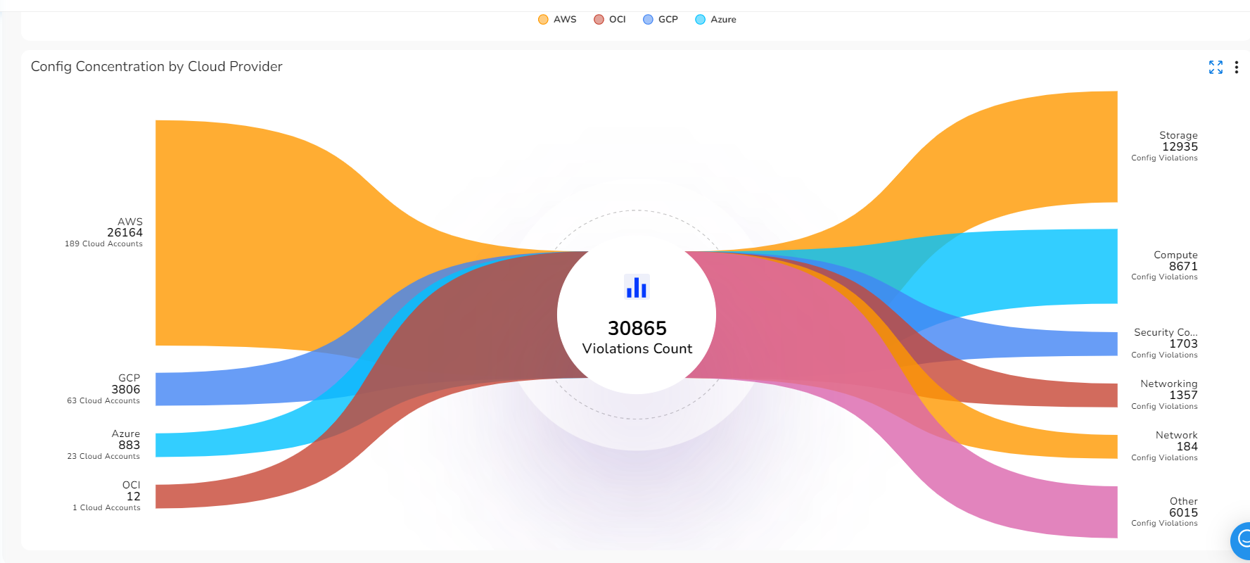
- Config Concentration by Cloud Provider: This widget shows a sankey chart with the count of config violation for the current month. The sankey chart shows service providers on the left side and resource types on the right side.
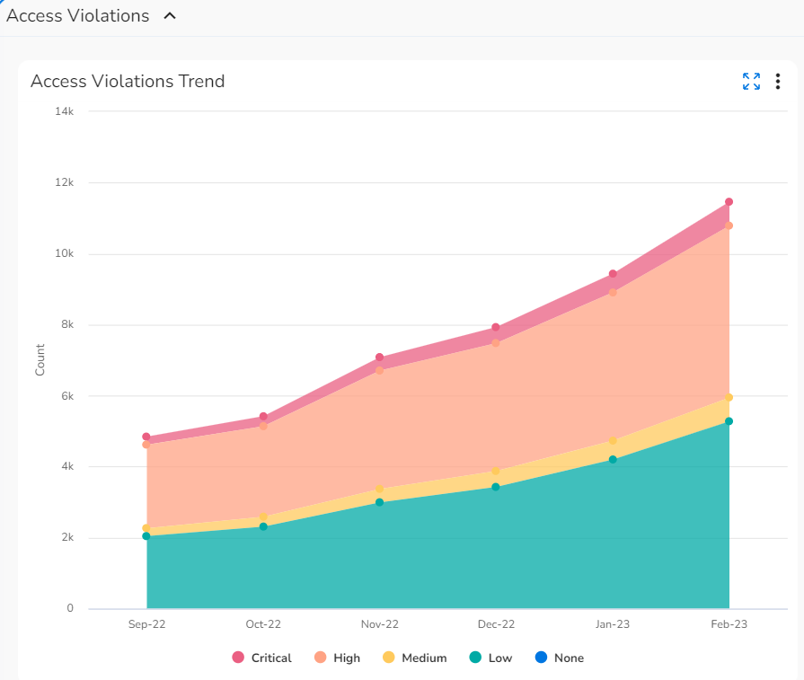
- Access Violations:
- Access Violations Trend: This widget shows a graph with the count of access violations for the past six months, as well as severity count. Severity can be shown as Critical, High, Medium, or Low.
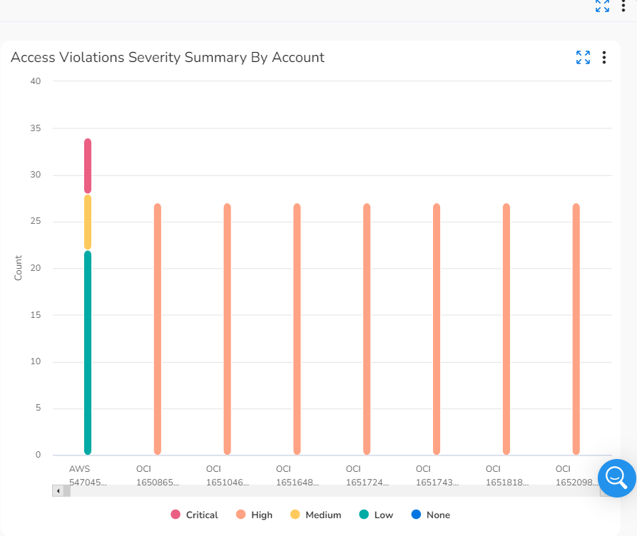
- Access Violations Severity Summary By Account: This widget shows the severity count of access violations for different accounts during a particular month. The total count of access violations for an account is also shown in this widget.
- Compliance:
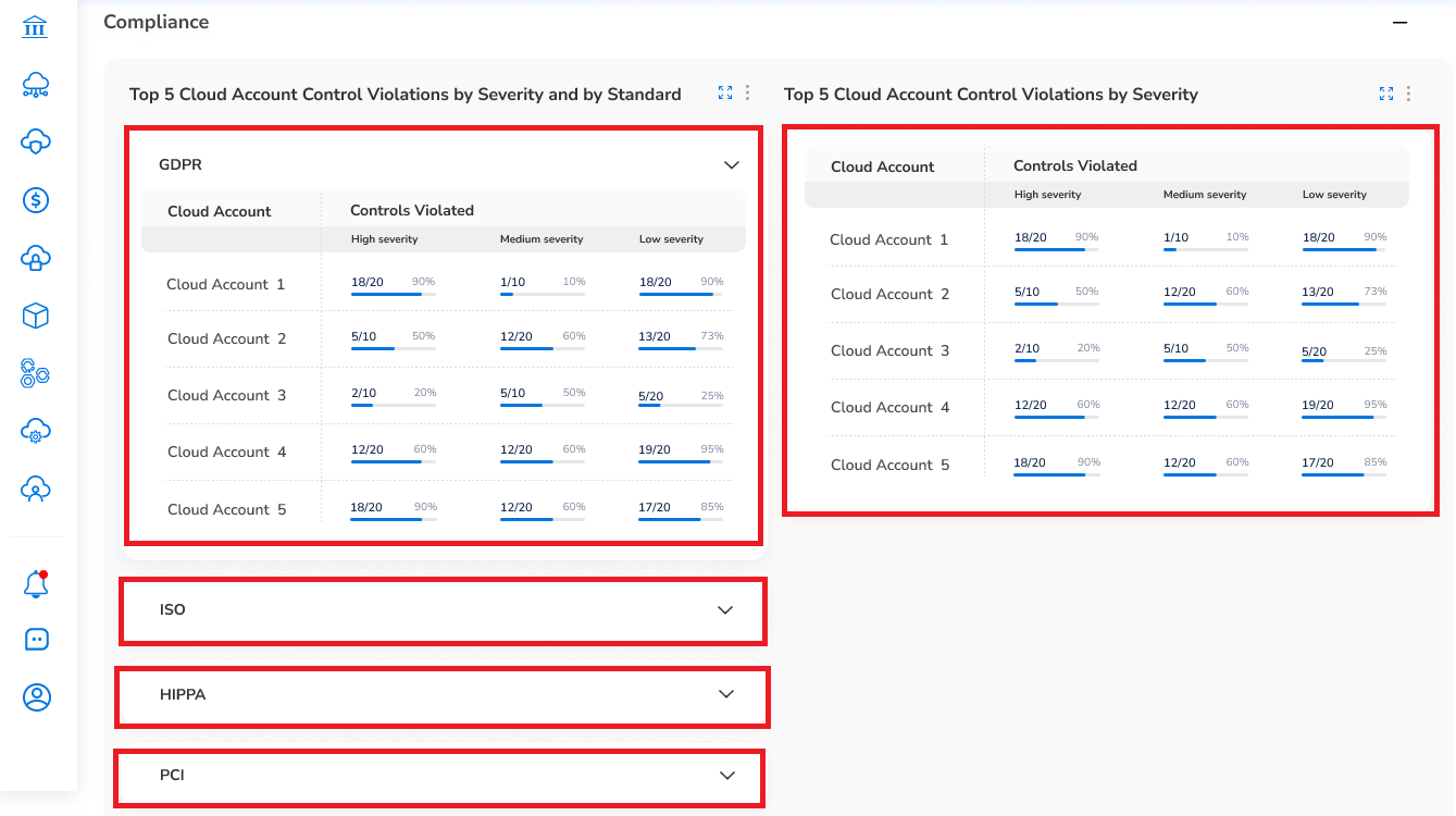
- Five Cloud Accounts with Lowest Coverage by Standard: This widget shows the top five cloud accounts with highest control violations (as per severity) against each compliance standard. The violated controls are classified as High, Medium, and Low severity. The data in this widget is shown in tabular format and users can view the control violation percentage and score for the respective cloud account.
- Top 5 Cloud Accounts With High Risk: This widget shows the top five cloud accounts with high risk compliance control violations. The risks for the cloud accounts are classified as per High, Medium, and Low severity. The data in this widget is shown in tabular format and users can view the risk percentage and score for the respective cloud account.
- Tenant Compliance Summary Widget: This widget shows compliance summary at tenant level for each of the compliance standards. The details in this widget are shown in tabular format.
- Cloud Account Compliance Summary Widget: This widget shows compliance summary at account level for each of the compliance standards. The details in this widget are shown in tabular format.
- Tenant Compliance Trend Widget: This widget shows compliance summary at tenant level for each of the compliance standards for the last 6 months. The details in this widget are shown as a line graph with each standard being shown in a single line. The x-axis of the graph shows the months and the y-axis shows the compliance percentage.
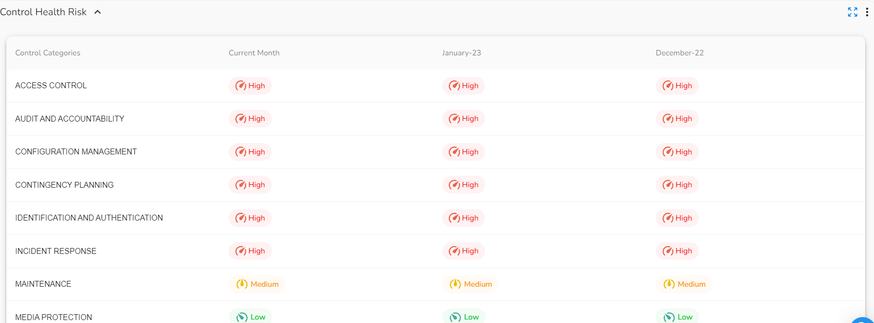
- Control Health Risk: This widget shows the control health of the selected user for the current month and last two months. This widget shows the control health status as High Risk, Medium Risk, or Low Risk. The data in this widget is shown in tabular format.
Navigating the SecOps Dashboard
Perform the following steps to view the different sections of the Security Executive Dashboard:
-
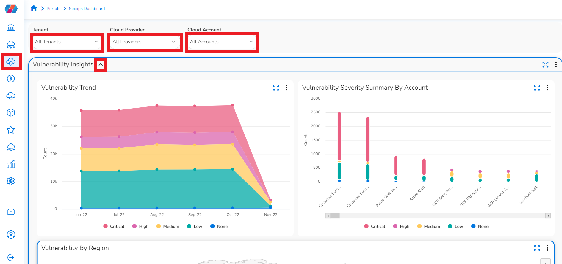
In the platform, click SecOps > Dashboard.
-
Click ADD+ and select the appropriate options from Tenant, Cloud Provider, and Cloud Account. The security dashboard will show widgets as per the applied filters and its values.
- If you select the Tenant list, then click to select the tenants you want to include and click Ok.
- If you select the Cloud Provider list, click to select the cloud providers you want to include and click Ok.
- If you select the Cloud Account list, then click to select the cloud accounts you want to include and click Ok.
All the options explained above can be applied based on the details you want to view in the dashboards.
Click the cross mark to remove any applied filter, if needed.
Note:
- Users can maximize the zoom level on the map and graph trends to view them more easily.
- Click + to expand the map and click – to shrink the map view.
- Click the three vertical dots icon provided in the sections/blocks to download details for the required widget.
- Click the three vertical dots and then click View As > Datatable to view details in tabular format.
Vulnerability Insights
Click the down arrow icon next to Vulnerability Insights. The vulnerability trends are shown in the following three sections on the screen:
- Vulnerability Trend: Hover your cursor over any of the dots in this chart to see the vulnerability count and severity count for a particular month.
- Vulnerability Severity Summary by Accounts: Hover your cursor over the vertical bars in this chart to see the vulnerability and severity counts for a particular account.
- Vulnerability by Region: Hover your cursor over the map to see more information about the severity counts for a particular region.
Threats
Click the down arrow icon next to Threats. The threat trends are shown in the following four sections on the screen:
- Threats Trend: Hover your cursor over any of the dots in this chart to see the threat count and severity count for a particular month.
- Threats Severity Summary By Account: Hover your cursor over the vertical bars in this chart to see the threat and severity counts for different accounts.
- Threats by Region: Hover your cursor over the map to see more information about the threat count for a particular region.
- Threats Concentration by Provider: Click a provider to see the threat count and the threat counts of the associated resources. The provider types are shown on the left and the resource types are shown on the right.
Config Violations
Click the down arrow icon next to Config Violation. The config violation trends are shown in the following four sections on the screen:
- Config Violations Trend: Hover your cursor over any place in this chart to see the config violation count and severity count for a particular month.
- Config Violations Severity Summary By Account: Hover your cursor over the vertical bars in this chart to see the severity counts of config violations related to different accounts.
-
Config Violations By Region: Hover your cursor over the map to see the config violation counts for a particular region.
-
Config Concentration by Cloud Provider: Click a provider to see the config violation count for the associated resources. The provider types are shown on the left and the resource types are shown on the right.
Access Violations
Click the down arrow icon next to Access Violations. The access violation trends are shown in the following three sections on the screen:
- Access Violations Trend: Hover your cursor over any place in this chart to see the access violation trend count and severity count for a particular month.
- Access Violations Severity Summary By Account: Hover your cursor over the vertical bars in this chart to see the severity counts of access violations related to different accounts.
Compliance
Click the down arrow icon next to Compliance. The compliance violations are shown in tabular format in two widgets:
-
Five Cloud Accounts with Lowest Coverage by Standard: Click the arrow symbol to expand the Compliance section and view the violations table. For example, there are sections for ISO, HIPPA, PCI, etc, that users can expand and view.
This widget shows the top five cloud accounts with the least compliance control coverage against each compliance standard. Users can view the scores and percentages of controls violated for different cloud accounts.
-
5 Cloud Account Control Violations by Severity: This widget shows the top five cloud accounts which have the highest score or percentage of high-risk compliance controls violated. If there are no high-risk control violations, then accounts that have the highest percentage of medium severity (50% of the medium severity) are displayed.
-
Tenant Compliance Summary Widget: This widget shows compliance summary at tenant level for each of the compliance standards. The details in this widget are shown in tabular format.
-
Cloud Account Compliance Summary Widget: This widget shows compliance summary at account level for each of the compliance standards. The details in this widget are shown in tabular format.
-
Tenant Compliance Trend Widget: This widget shows compliance summary at tenant level for each of the compliance standards for the last 6 months. The details in this widget are shown as a line graph with each standard being shown in a single line. The x-axis of the graph shows the months and the y-axis shows the compliance percentage.
Control Health Risk
Click the down arrow icon next to Control Health Risk. The control health details are displayed in a tabular format. Users can view the risk levels associated with various control categories for the last three months.
Updated 8 months ago