

Cost Anomaly Widgets in Dashboard
1. Introduction
Follow these precise instructions to efficiently set up and configure the widgets in the Dashboard page to monitor cost anomalies within your cloud accounts.
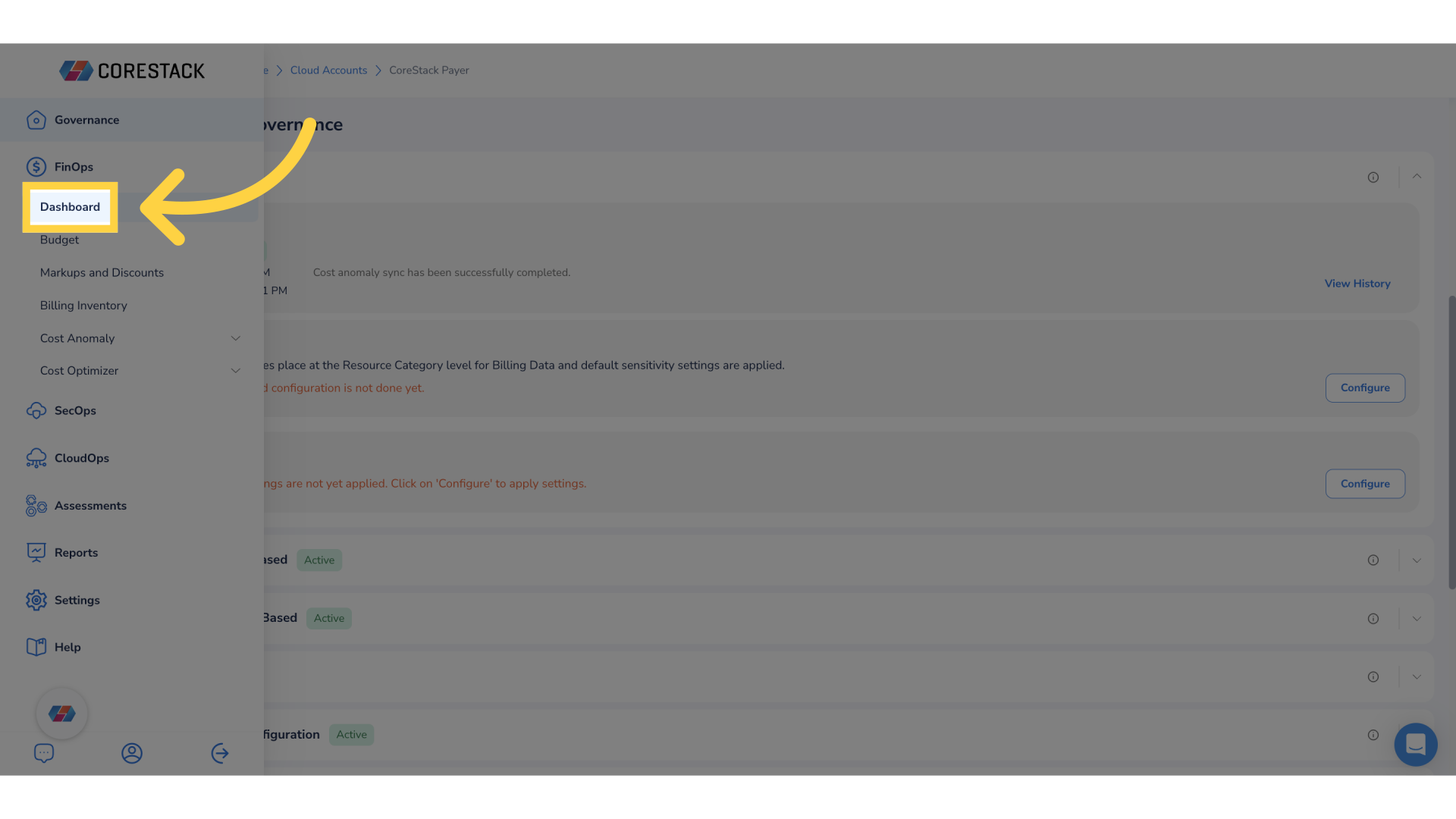
2. Click "Dashboard".
Click FinOps > Dashboard.
3. Click Actions.
Click the Actions drop-down list.
4. Click "Add Widget".
Click Add Widget to add a new widget to the dashboard. The Create New Widget screen appears.
5. Search for the widget name.
Search for the widget name in the drop-down list.
6. Select "Cost Anomaly Impact By Cloud Account".
Select the widget Cost Anomaly Impact By Cloud Account and then click Next.
7. Click "Data Binding".
In the Data Binding tab, select relevant options.
8. Set up Target Filter and Filter Settings.
In the Target Filter drop-down list, select Filter and then enable relevant field in the Filter settings section.
9. Click "Refresh Rate".
Click the Refresh Rate tab. Here you can enable the field Refresh Automatically and then select an option from the drop-down list that appears below.
10. Click "Chart Type".
Click Chart Type tab to select the type of chart.
11. Select the chart type.
Click the drop-down list and select the type of chart for the widget.
12. Select "Bar".
In this case, select the chart type as Bar.
13. Click "Legend".
Click the Legend tab to make the relevant settings.
14. Click "Enabled".
Select Enabled to display legend in the widget.
15. Select alignment and size.
Select appropriate options related to the legend in the following fields:
- Horizontal Alignment
- Vertical Alignment
- Size
16. Click "Navigation".
Click Navigation to access this tab and then select the required options.
17. Click "Name & Description".
Click the Name & Description tab and fill the following details:
- Title Description
- Toolbar Behavior
18. Click "Finish".
Click Finish to complete the widget configuration.
19. Click Apply Changes.
Click the tick mark Apply Changes to add the new widget to the dashboard.
20. Click ellipses.
Click the ellipses on the widget you have just created.
21. Click "Configure widget".
Select the Configure widget option to modify the widget configuration. The configuration screen for the widget appears.
22. Click "Chart Type".
Click Chart Type to view this tab and then change the existing chart type. Currently, the chart type is selected as Bar, but click the drop-down list and then select Line.
23. Click Finish.
Click Finish after making all the changes in the widget.
24. Click Apply Changes.
Click the Apply Changes tick mark to apply the changes in the widget.
25. Click ellipses.
Click the ellipses on the widget.
26. Click "Cut".
Select the Cut option to remove the widget from the existing dashboard.
27. Click Apply Changes.
Click the Apply Changes tick mark to apply the changes in the widget.
This guide covered detailed instructions on configuring cost anomaly widgets in the CoreStack dashboard, including adding widgets, setting up data bindings, applying filters, selecting chart types, and completing the widget configuration process.
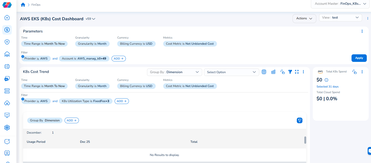
Note that the Cloud Account filter has been renamed to Account, and the Cloud Provider filter has been renamed to Provider.
For example, if you see the dashboard shown in the screenshot below, the Parameters > Filter section shows the Provider filter for which the value selected is AWS.
To add the Account filter, users can click ADD+ and select Account. In the drop-down list that appears, users can select all applicable values, and click Ok. Details will be displayed in widgets as per the selected filter(s).
In every widget that is available within a dashboard, users can click the Filter icon that appears on the top-right side of the widget and view the pre-defined filters. The Provider filter appears as a pre-defined filter. Users can use the ADD+ option to add custom filters and they have the option to add the Account filter from here.
Updated 7 months ago