

Navigating within Reports
Navigation Options Within Analytics Reports
There are many navigation options available within analytics reports. Users can use the available options as per their need. Refer to the following steps to understand when users must use the different options available within the analytics report.
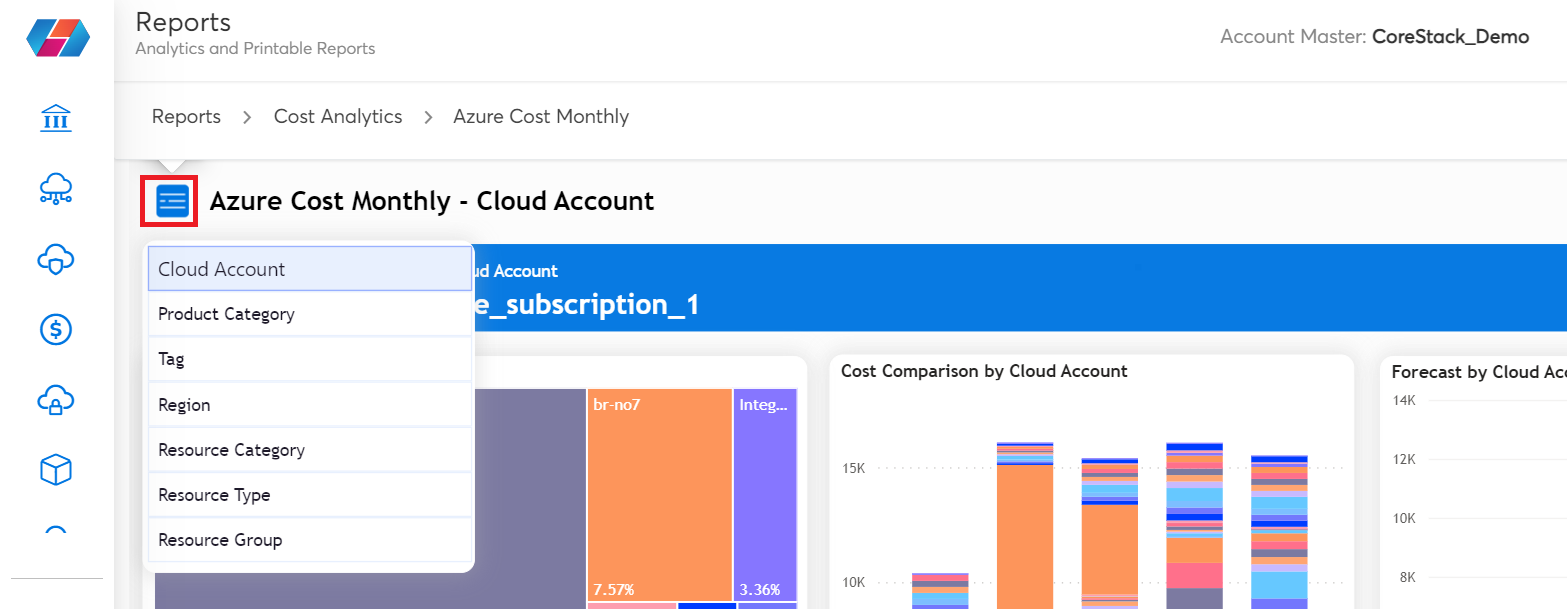
- Navigation: The blue icon on the left of the analytics page is used for navigating to different views available for a particular report. For example, click the blue icon and select Product Category to view the report as per the available product category.
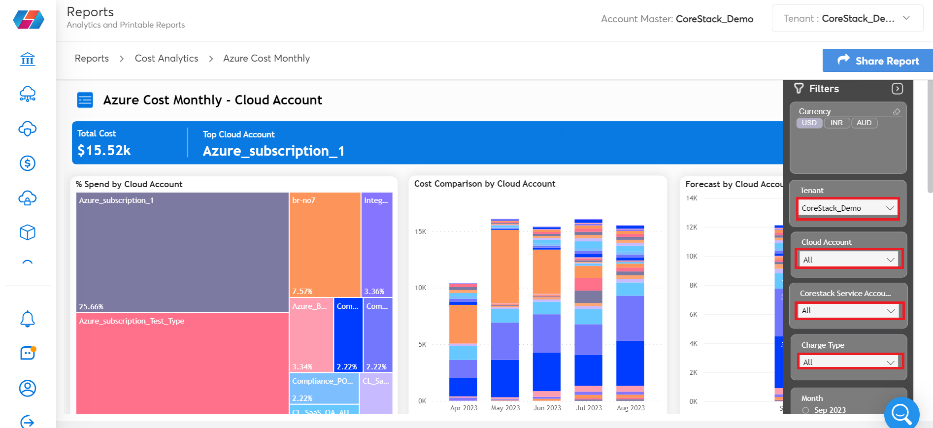
- Filter: After you select the report view on which analysis needs to be done, you can use the Filters pane on the extreme right side of the screen to drill down further in the report.
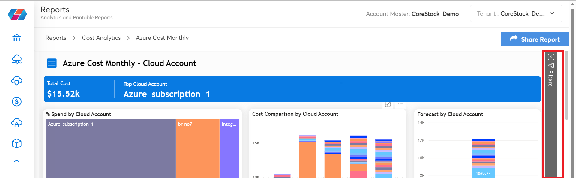
For example, users can click Filters to view the available filtering options related to the navigation view they have selected. Users can then select the relevant values for the fields that are displayed and view the report details. This helps users to slice and dice the data as per their requirements.
- Widget options:
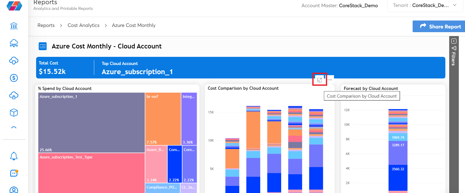
- Focus Mode: This option helps users to expand a particular widget to a full screen view.
- More Options (three horizontal dots): When users click the three dots icon, they get multiple options to select from.
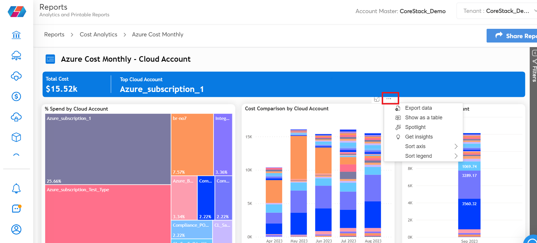
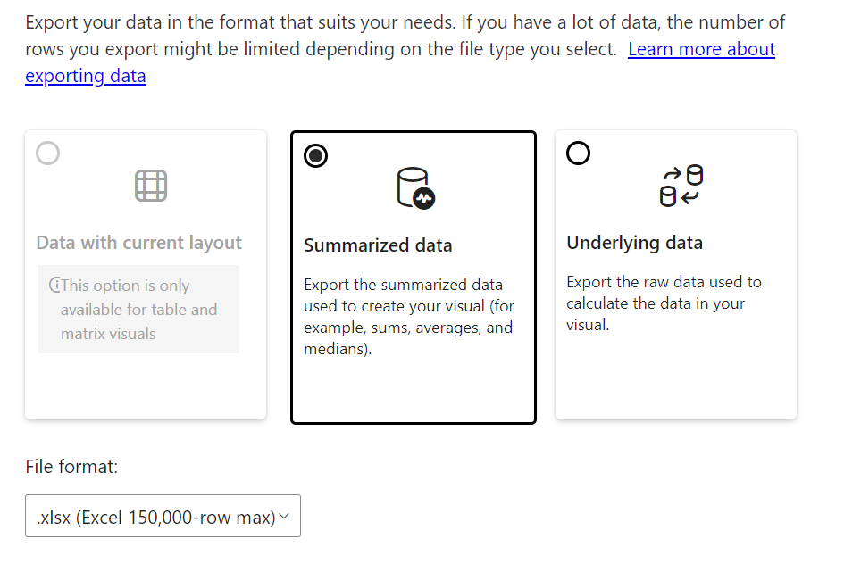
- Export Data: Select this option to export data from the grid table view in an .xlsx or .csv format. You can choose to download the same in either standardized format or raw format.
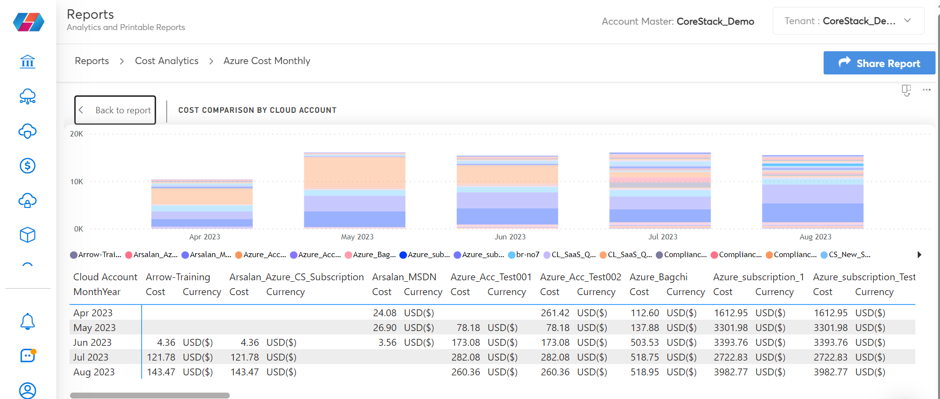
- Show as a Table: Select this option to view a particular widget as a data table along with the chart.
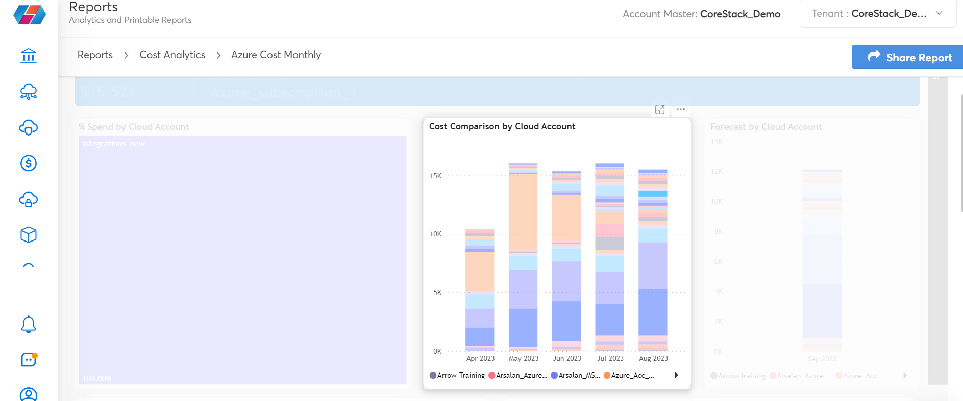
- Spotlight: This option helps to highlight a particular widget on the screen and fades out the other widgets.
- Sort axis: This option is used to sort the data on the widget based on the axis. For example, if users want to sort the data according to the cost or by month, they can use the sort axis option whenever available.
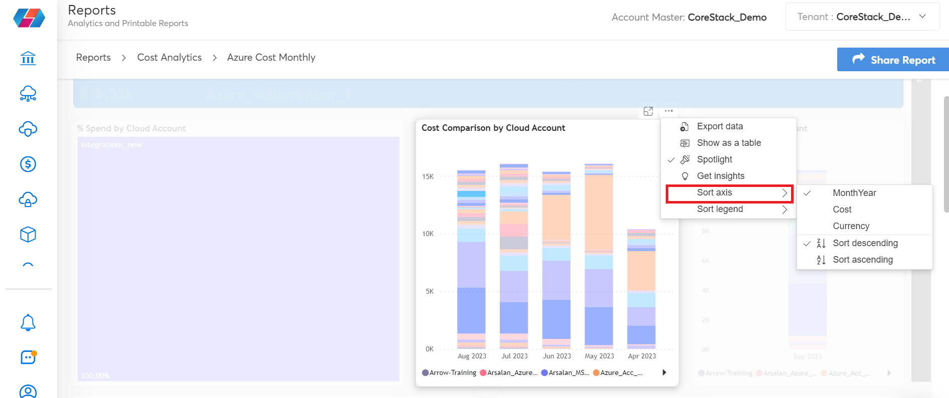
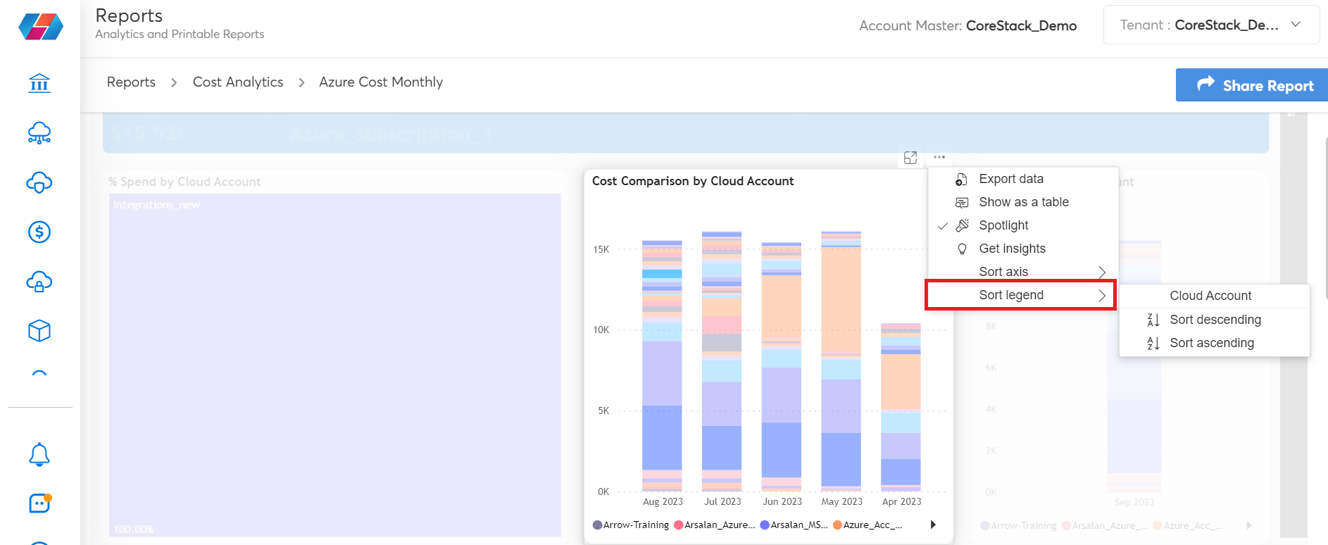
- Sort legend: This option is used to sort the data on the widget based on the legend. If there are legends available for the data, then those can be sorted from ascending to descending and vice versa.
- Options on the table grid (table grid is shown below all the charts):
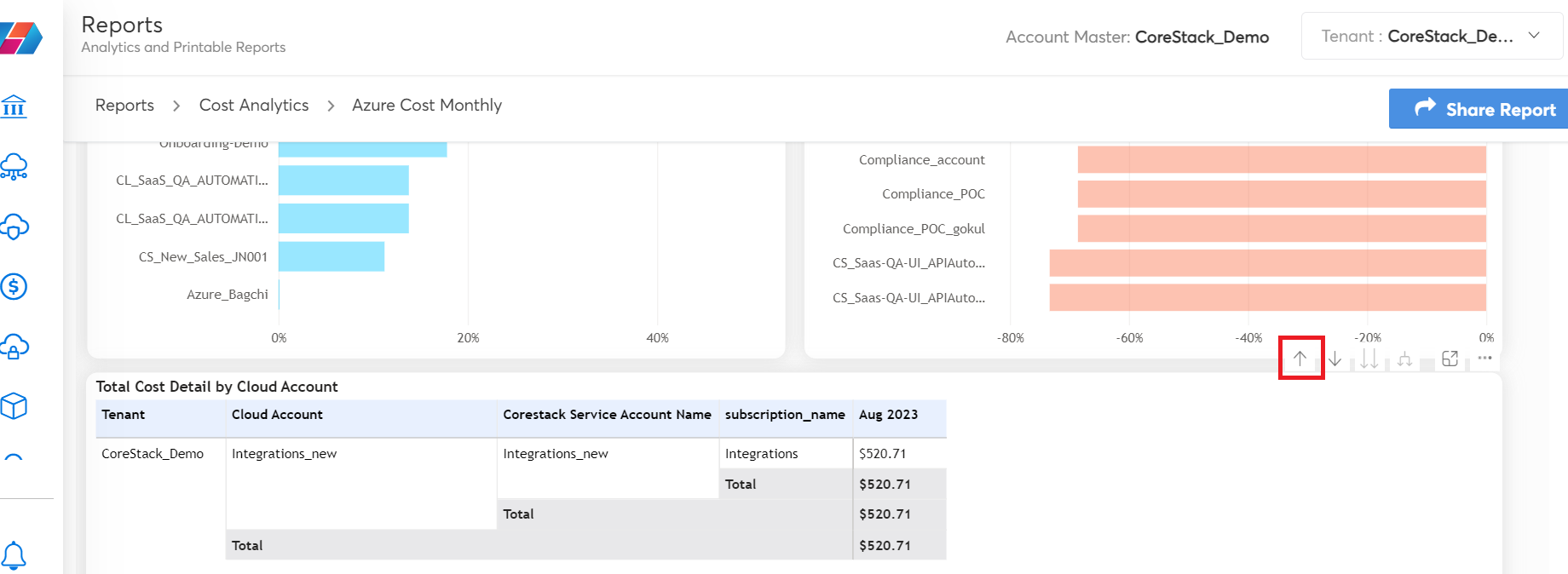
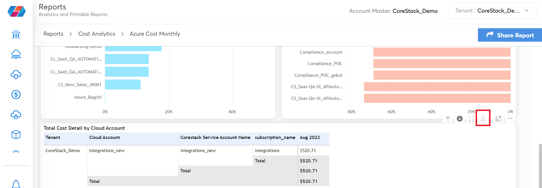
- Drill Up: Use this option to hide columns and get the desired view. For example, the grid table will have many columns showcasing data and there can be a long scroll on the right side of the grid table. In such cases, the Drill Up option can be used to hide the columns, which can help truncate the grid table and get the desired view.
-
Drill Down: This option helps to drill down into any specific data on the analytics report. When users click on the Drill Down symbol, the drill down mode will be turned on and they can click any data point on the analytics chart. This will now show the drill down report details.
For example, in the report shown below, the drill down mode is on and the user has clicked Azure subscription_1 data point. This will enable only data relevant to Azure subscription_1 to be displayed on all widgets and in the table grid.
-
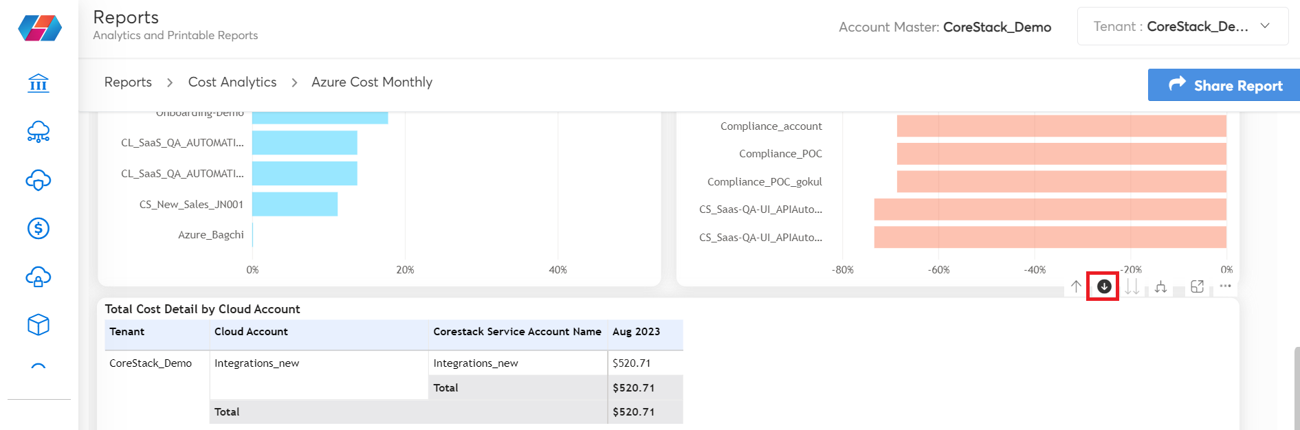
Expand: This option helps to get back to the original view (with all the columns) on the grid table, that is, this option is used to undo the changes that are brought in by the drill up option.
Navigation Options Within SSRS Reports
Navigating within SSRS reports is quite easy. You can use the options available within the horizontal pane (seen at top of the screen) to select them and apply to the report. After generating the report, you can use the First, Previous, Next, and Last arrow symbols to go to different pages within the report.
Use the Zoom-out (-) and Zoom-in (+) symbols to adjust the report size with respect to ease of viewing it on the screen. Use the Zoom list to select a zoom percentage as per which report display size will change.
You can use the Export icon to export the report dtails in PDF or Excel format.
The Subscribe icon can be used to subscribe and schedule a report. Refer to Subscribing to SSRS Reports to get the details steps.
Updated 9 months ago