Cost Dashboard
Introduction
In the CoreStack application, a framework is used to create widget-based dashboards, resize widgets, save widgets, add permissions for dashboards, and more.
These dashboards are dynamic in nature. A user can create their own dashboard and add various widgets to look at the data as per their convenience and requirement. A user can create multiple dashboards. Based on the user-role, certain users can share the dashboard with another user by assigning relevant permissions.
This user guide will focus on the Cost Executive Dashboard, how users can leverage it to understand their cloud spending and visualize cost data in meaningful ways, and how they can create and modify their own custom dashboards.
Adding a New Dashboard
A dashboard is a collection of data trends that is presented in different types of charts. This means that a dashboard can have multiple charts.
Perform the following steps to add a new dashboard:
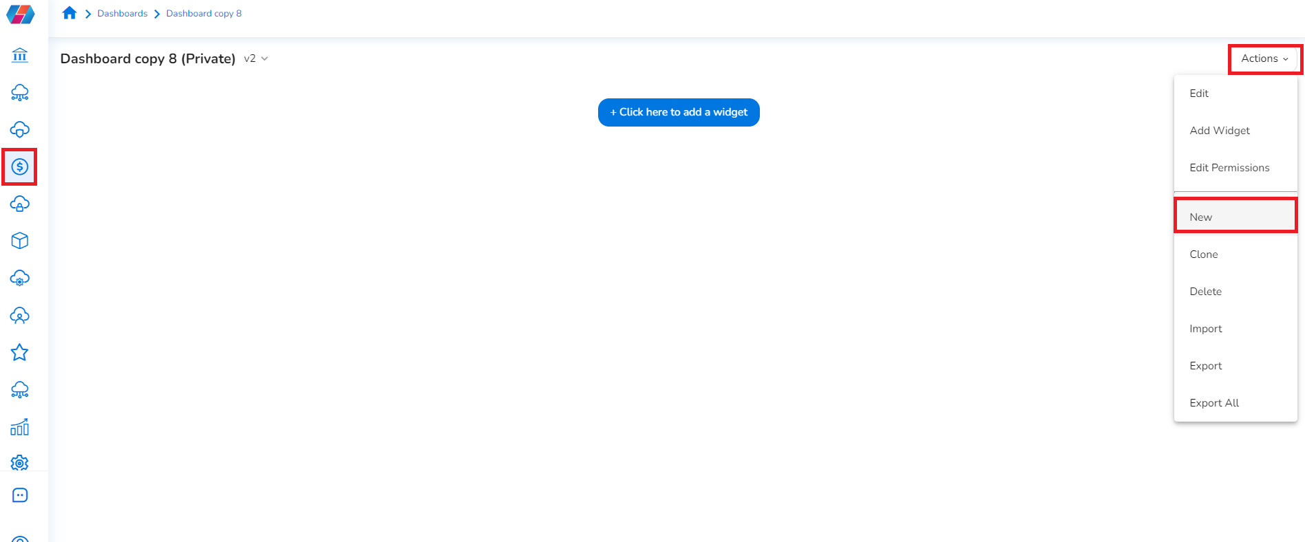
- Sign in to the CoreStack application and click Cost > Dashboard.
- In the Actions list, click New. This creates a new dashboard.
Adding a New Widget to a Dashboard
A widget is a chart trend that can be added to a dashboard.
Users can add multiple widgets to a single dashboard. The data presented through widgets is used to understand certain data trends.
Perform the following steps to add a new widget:
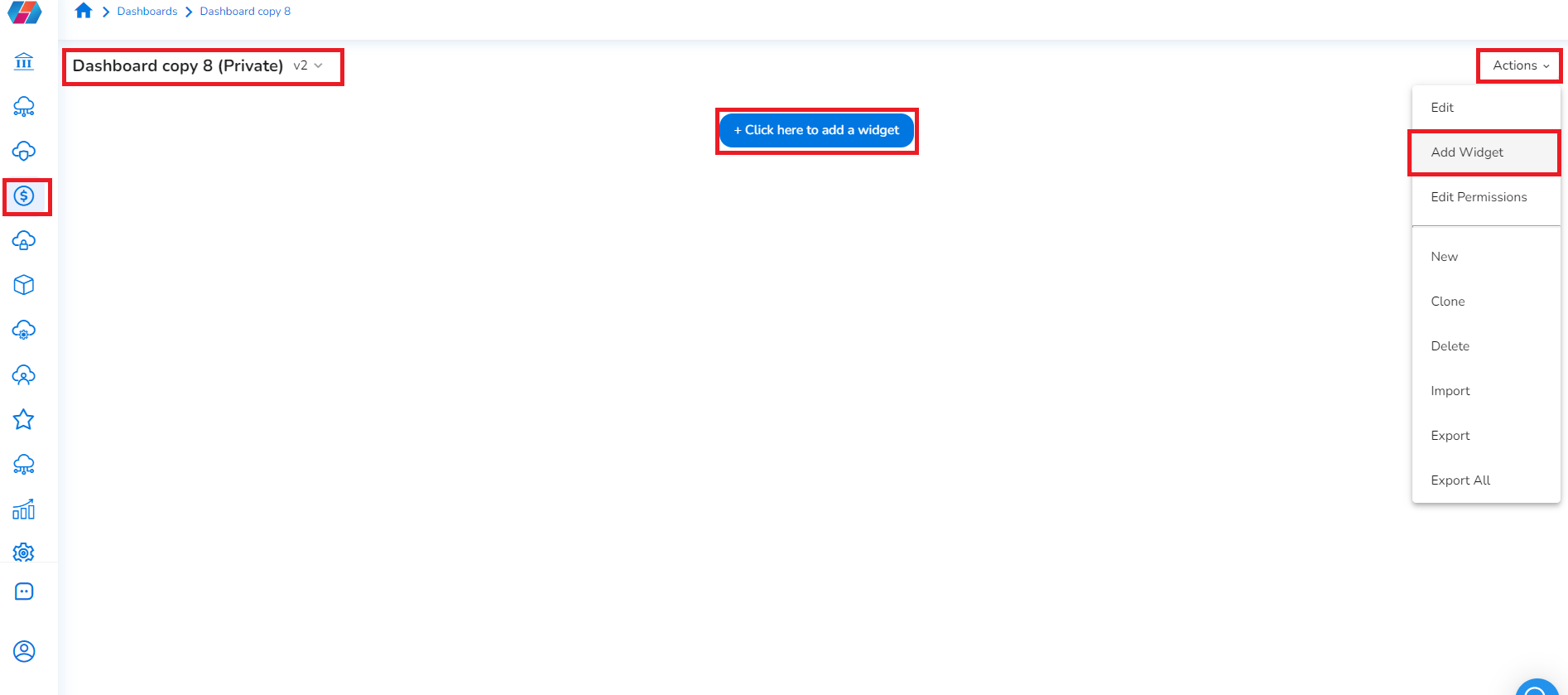
- In the CoreStack application, click Cost > Dashboard.
By default, the dashboard that was last worked on is displayed. - On the top-left of the screen, in the drop-down list, click to select the dashboard where a widget needs to be added. The selected dashboard is displayed.
- To add a new widget, select Click here to add a widget. Alternately, in the Actions list, click Add Widget. The Create New Widget screen displays.
Widget Types
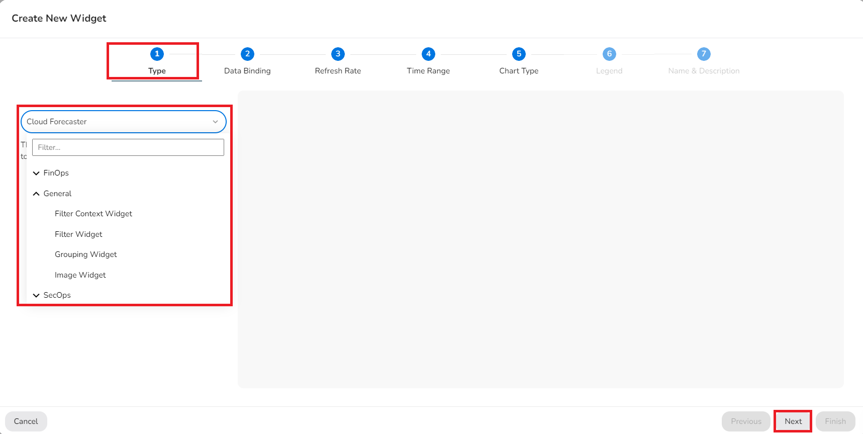
The available widget types are categorized as FinOps, General, and SecOps. Users must select a category and then select a widget type.
The following categories and widget types are available for users:
| Widget Category | Widget Type |
|---|---|
| FinOps (Cost and budget) | • Budget Drift • Cloud Forecaster • Cost Anomaly By Cloud • Cost Anomaly Impact By Billing • Cost Anomaly Impact By Event • Cost of Resources by Product Category • Cost Optimization by Optimization Type • Cost Optimization Trend • Cost Spend By Cloud • Cost Spend By Cloud Account • Cost Spend By Cloud Resource Category • Cost Spend By Region • Cost Spend By Tag Level • Cost Spend By Tenant • Cost Summary • Cost Trend By Cloud • Tag Level Trend • Top Budget By Tenant • Top Cost Optimization |
| General (General filters) | • Filter Context Widget • Filter Widget • Grouping Widget • Image Widget |
| SecOps (Security operations) | • Access Violations By Cloud Account • Access Violations Trend • Config Concentration by Cloud Provider • Config Violations By Region • Config Violations Severity Summary By Account • Config Violations Trend • Control Health Risk • Five Cloud Accounts with Lowest Coverage by Standard • Threats By Region • Threats Concentration by Provider • Threats Severity Summary By Account • Threats Trend • Top 5 Cloud Accounts With High Risk • Vulnerability By Region • Vulnerability Severity Summary By Account • Vulnerability Trend |
On the Create New Widget screen > Type tab > drop-down list > click to select one option from FinOps, General, and SecOps, then select the type of widget that needs to be created.
- FinOps: Select this option to add widgets related to FinOps/cost.
- General: Select this option to add general filter widgets that will be used to filter data and show charts.
- SecOps: Select this option to add widgets related to SecOps/security.
Tip:
It is recommended to select and add a Filter Widget at the top of a dashboard.
Note:
Based on the type of widget selected, different tabs will be displayed along the top.
All the available tabs that appear for different widgets are explained in the steps below. Please refer to the tab-specific steps corresponding to a particular widget as needed.
Click Next.
Data Binding and Filters
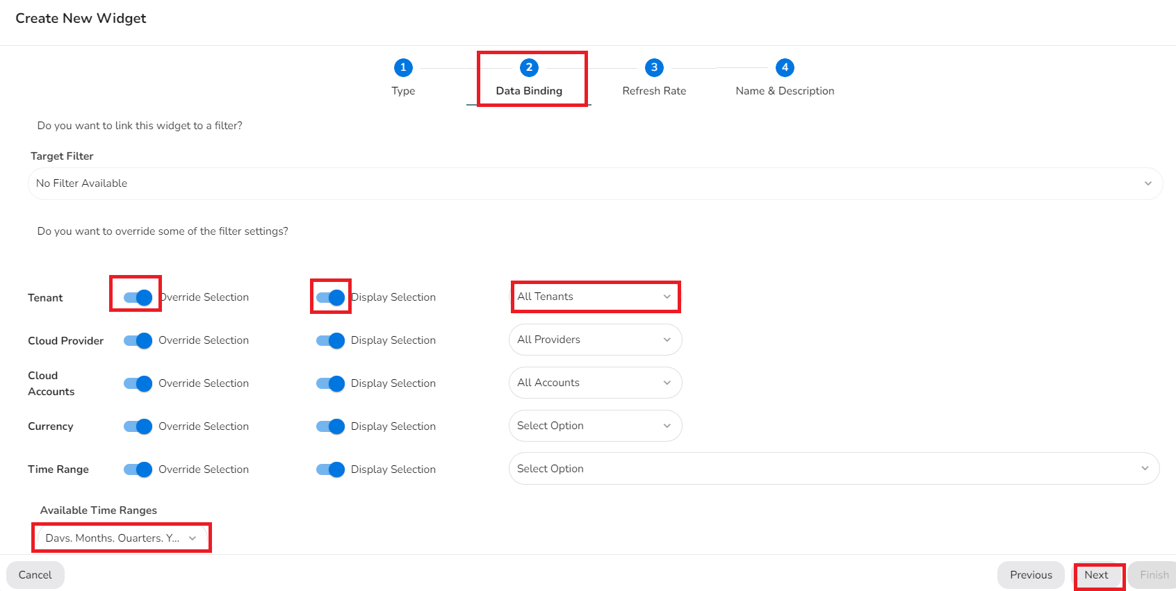
On the Data Binding tab, in the Target Filter list, click to select the desired filter for the widget.
Note:
Most widgets are data-driven, and there might be a need to filter the data present in the visualizations to view specific details. This is done by creating a Filter widget.
Filter widgets allow you to place a widget on the dashboard and configure its attributes. After a filter widget is created, other widgets can be created and bind to that filter. The widget shows the updated data visualization as per the filters applied, and when any change is made in filter selection the data in the widget is also updated.
When binding to a filter, you can choose whether to override some of the settings from the filter. For example, if you want to always show data from a particular time range in a widget, you can override the time range selection and pick the appropriate time range for that widget. As the filters change, the time range for this widget will not change.
To override filter settings, perform the following in the Tenant, Cloud Provider, Cloud Accounts, Currency, and Time Range fields:
- To enable Override Selection, slide the button to right.
- To enable Display Selection, slide the button to right.
- In the drop-down list on the right, click to select the appropriate options. Multiple options can be selected for Tenant, Cloud Provider, and Cloud Accounts.
In the Available Time Ranges list, click to select the appropriate time range.
Click Next.
Grid
On the Grid tab, perform the following to configure the widget grids:
- To define the number of rows for a grid, in the left box, click the up or down arrow to add the required number of rows.
- To define the number of columns for a grid, in the right box, click the up or down arrow to add the required number of columns.
- In the Change Density field, click the up or down arrow to increase or decrease the density of grids.
The grids are displayed as per the details that are entered.
Click Next.
Image
On the Image tab, perform the following to add an image for a widget:
- In the Background Color box, click the box and select the desired background color.
- In the Placement list, click to select how the image will be aligned.
- Click Add Image > in the Import Logo dialog box, click Upload File > select an image > click Import.
An image will now be uploaded.
Click Next.
Refresh Rate
On the Refresh Rate tab, in the Refresh Automatically field, slide the button to right to enable it.
- In drop-down list, click to select an appropriate option. The page will be refreshed automatically as per the minutes selected by the user.
Click Next.
Time Range
On the Time Range tab, in the drop-down list, click to select the time period for which the cost needs to be calculated and shown in the widget.
Click Next.
Chart Type
On the Chart Type tab, in the drop-down list, click to select the chart type that needs to be added for the widget.
Click Next.
Chart Limit
On the Chart Limit tab, click to select the data limit as per which data will be displayed on the chart.
Click Next.
Trend Granularity
On the Trend Granularity tab, click to select the granularity option as per which data will be displayed.
Click Next.
Category Type
On the Category Type tab, in the Category Type list, click to select the category type as per which data needs to be displayed.
Click Next.
Resource Type
On the Resource Type tab, in the Resource Selection list, click to select the resource type as per which the data needs to be displayed.
Click Next.
Optimization Type
On the Optimization Type tab, in the Optimization Selection list, click to select the cost optimization type as per which data needs to be displayed.
Click Next.
Tag Level Type
On the Tag Level Type tab, in the Tag Level Type list, click to select the tag level type as per which data needs to be displayed.
Click Next.
Cost Summary Type
On the Cost Summary Type tab, in the drop-down list, click to select the cost summary type as per which data needs to be displayed.
Click Next.
Legend
On the Legend tab, to enable a legend to be displayed in the chart, click to select Enabled.
If users select Enabled, then the following settings need to be made for the legend *:
- In the Horizontal Alignment list, click to select one option from Center, Left, and Right.
- In the Vertical Alignment list, click to select one option from Bottom, Top, and Middle.
- In the Size list, click to select one option from Small, Medium, and Large.
*Legend refers to the keys/parameters that explain a graph or chart.
Note:
Not all chart visualization options support the Legend feature.
Click Next.
Budget Type
On the Budget Type tab, in the Budget Configuration Type list, click to select either Actual or Forecast as the budget drift.
Name & Description
On the Name & Description tab, fill the following:
- In the Title list, type the title of the widget.
- In the Description box, type a description for the widget.
- In the Toolbar Behavior list, click to select the type of toolbar.
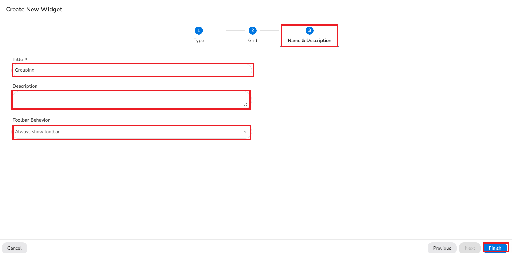
Finally, click Finish to complete the process for adding a new widget.
Grouping Widgets
A grouping widget is a type of widget that is used to add multiple widgets within a single grid (except for another grouping widget).
This means that grouping widgets can have multiple widgets of different types within them. Grouping widgets have a configurable grid system that allows for finer display control. Multiple widgets can be added within the grouping widget based on the defined grid size.
Add a New grouping Widget
Perform the following steps to add a new grouping widget:
- On the top-left corner of the screen, click to open the dashboard where the grouping widget needs to be added.
Or, If the grouping widget needs to be added in a new dashboard, then in the Actions list on the top-right corner of the screen, click New.
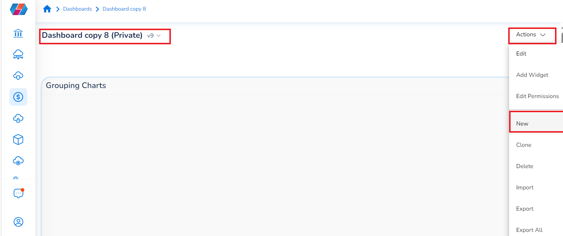
- To add a grouping widget, in the Actions list, click Add Widget.
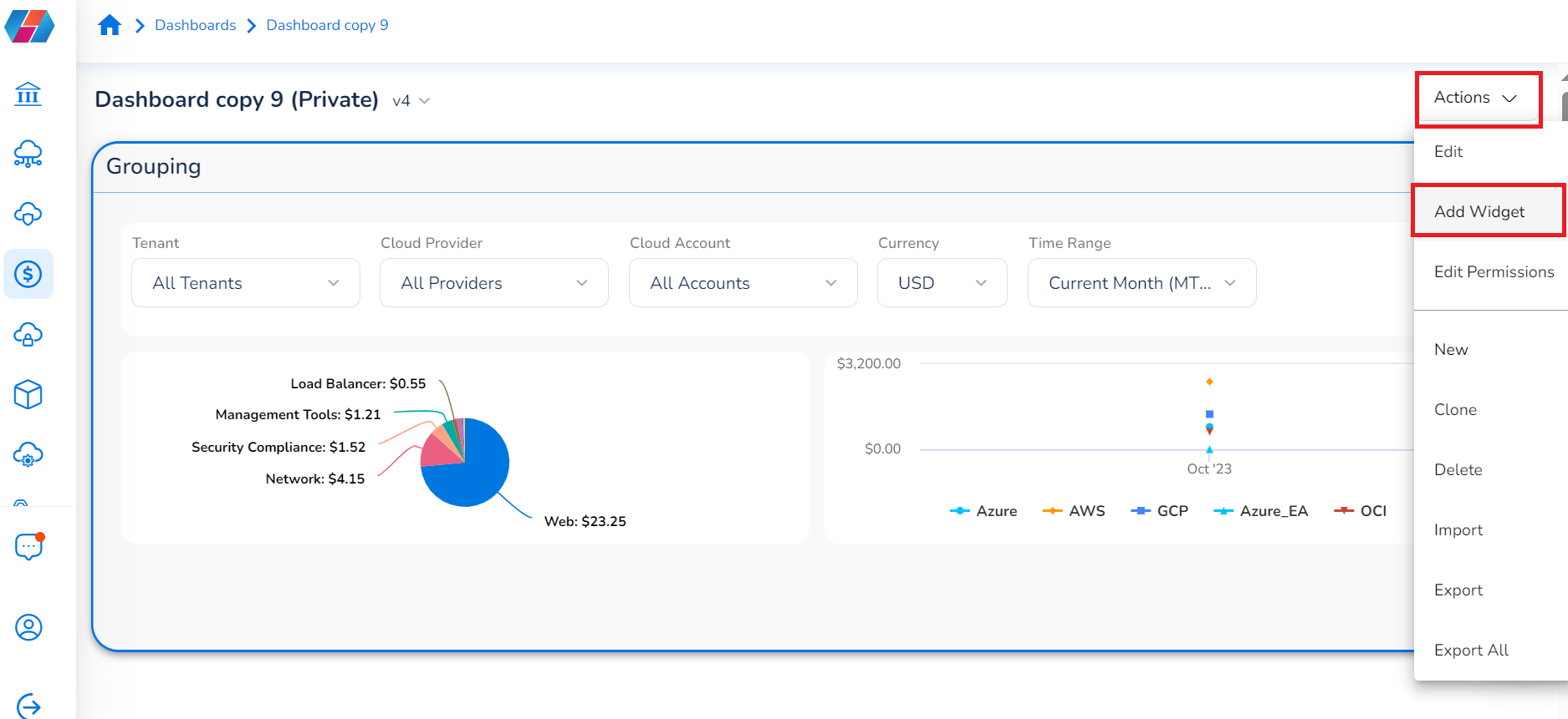
The Create New Widget dialog box opens and Grouping Widget shows up by default in the drop-down list on the left side.
3. Alternatively, in drop-down list on the left, click General > Grouping Widget.
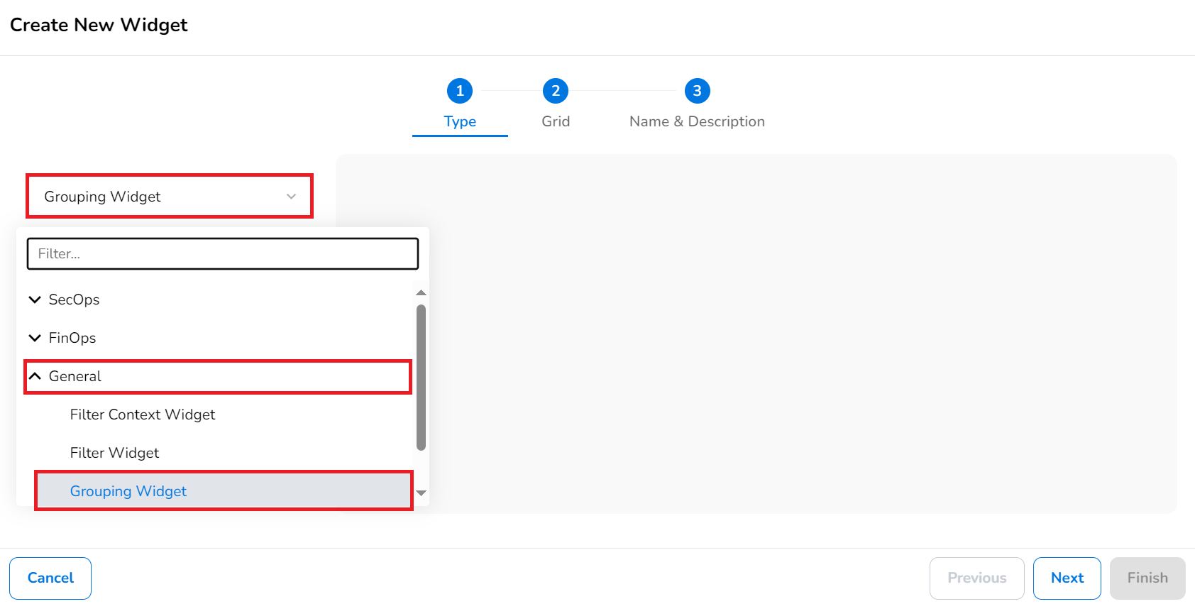
-
Click Next.
-
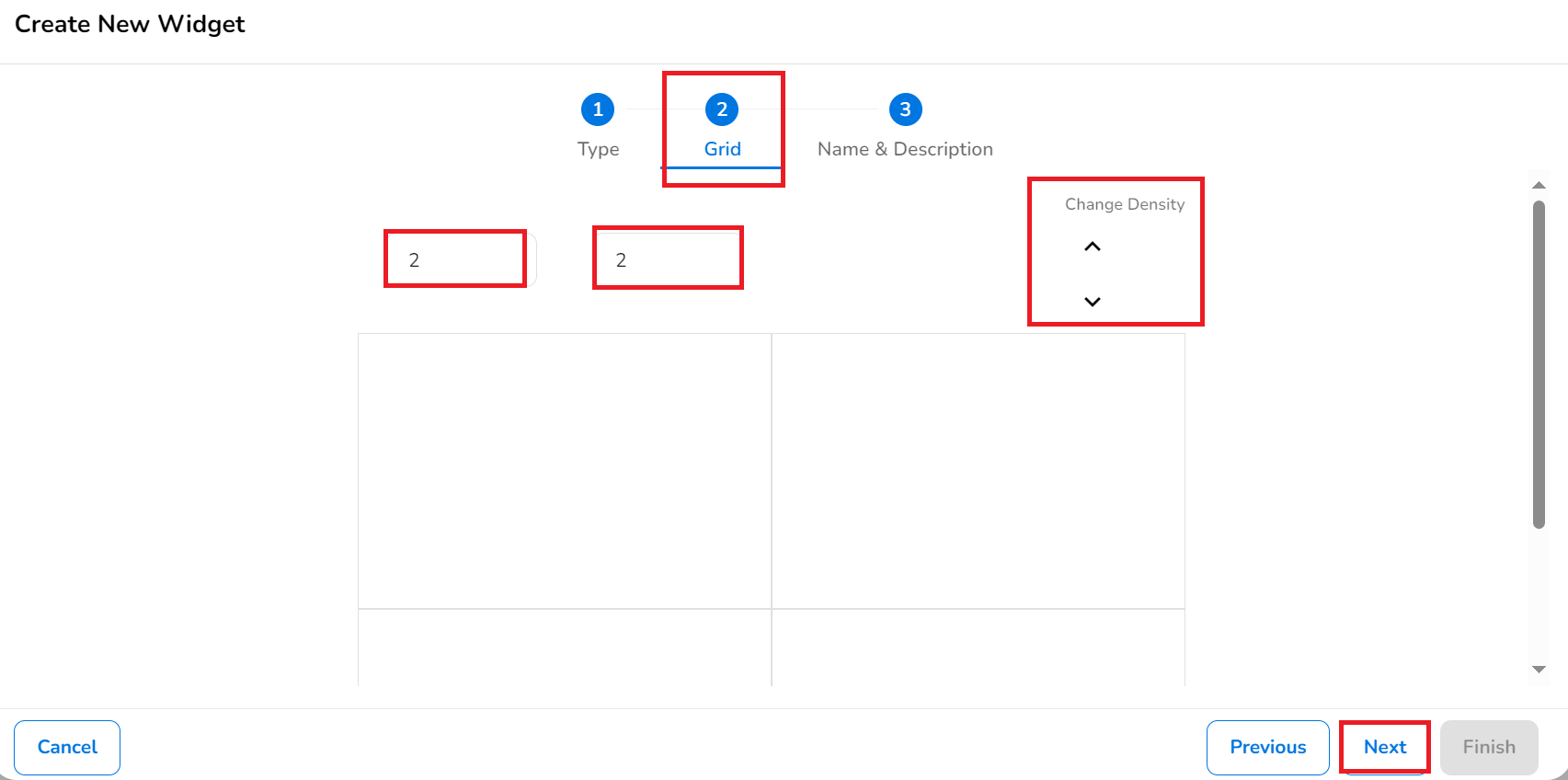
On the Grid tab, set the grids for the grouping widget.
- In the left box, type the number of rows for the grid or click the up/down arrows to select a value.
- In the right box, type the number of columns for the grid or click the up/down arrows to select a value.
- In the Change Density section, click the up/down arrows to select the grid density.
-
Click Next.
-
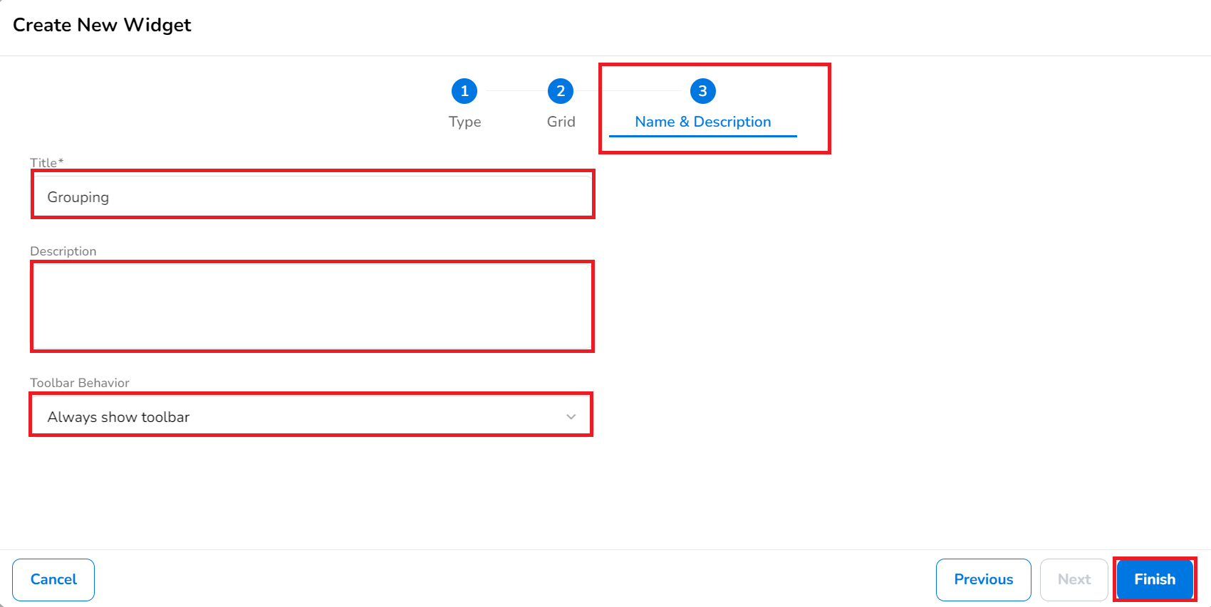
On the Name & Description tab, do the following:
- In the Title box, type the name of the widget.
- In the Description text box, type a description of the widget. This is not a mandatory field.
- In the Toolbar Behavior list, click to select one option from Always show toolbar, Auto hide toolbar, Collapsible widget, and Always hide toolbar. By default, the Always show toolbar option is selected. This is not a mandatory field.
-
Click Finish. The grids are displayed now.
-
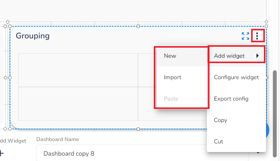
To add a widget in a grid, click the three vertical dots, and click Add Widget > New, Import, or Paste.
- New: This option adds a new widget. Refer to Adding New Widget to a Dashboard.
- Import: This option can be used to import a widget. A dialog box opens, where you can click Upload File, then select the required file to be imported, and click Import.
- Paste: This option can be used to paste a copied widget.
You can copy widgets from outside of the grouping into the grouping, but drag-drop is not supported.
Note:
It’s recommended to select Filter Widget first and add it to the grouping widget.
- Repeat the step above to add other widgets in the grouping widget.
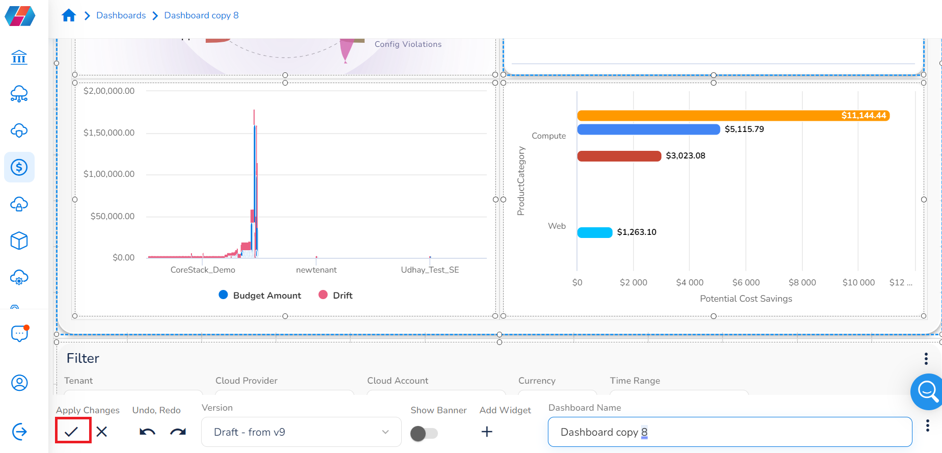
- Click Apply or the checkmark symbol to accept the widgets in the dashboard.
Editing a Dashboard
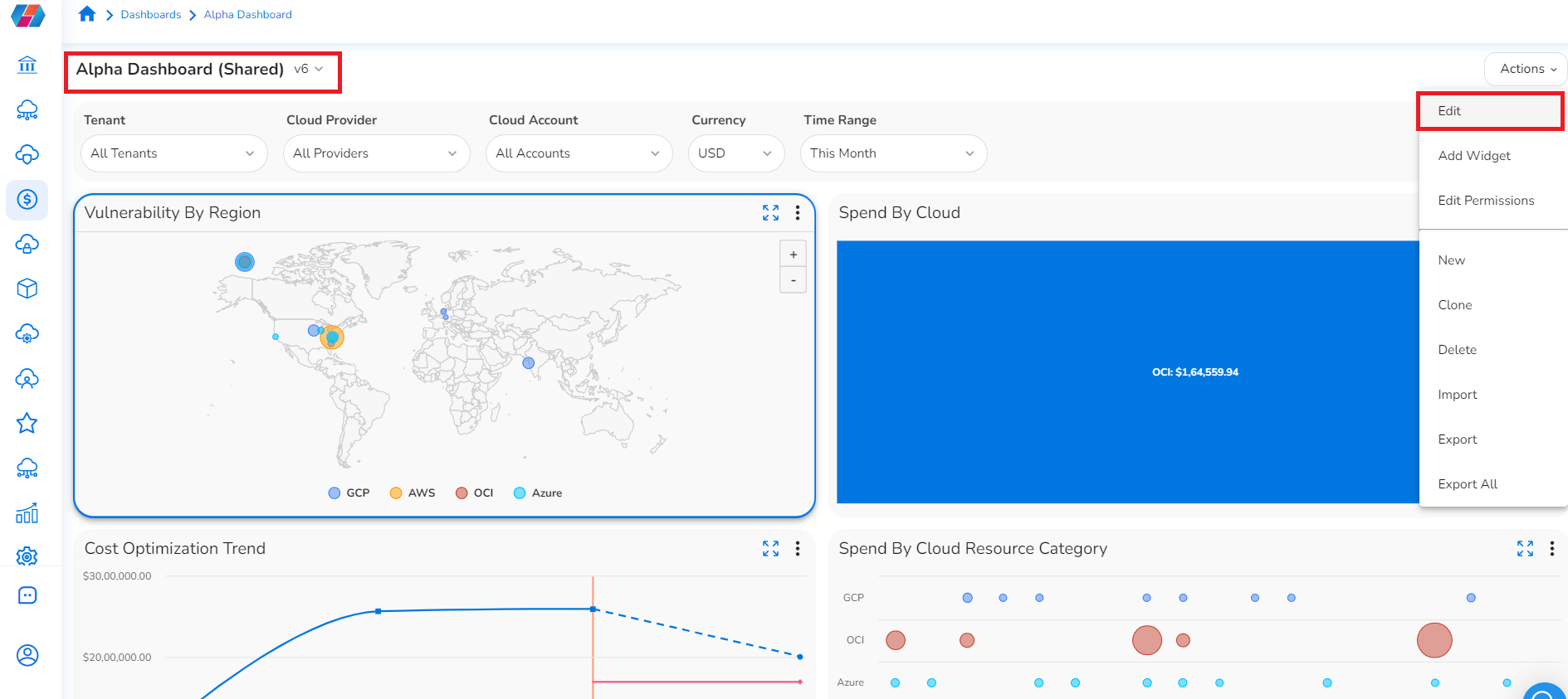
To edit a dashboard, follow the below steps:
- On the top-left corner of the screen, click the list to select a dashboard that needs to be edited.
- In the Actions list, click Edit.
- Perform the required actions like add a new widget, resize a widget, move a widget, add a banner, rename a dashboard, etc.
- Click the checkmark symbol (bottom left of the screen) to accept the changes in the dashboard.
Additional Actions on a Dashboard
After all the widgets are added and the required settings are configured, users can then perform any of the following relevant actions:
Using the dashboard toolbar
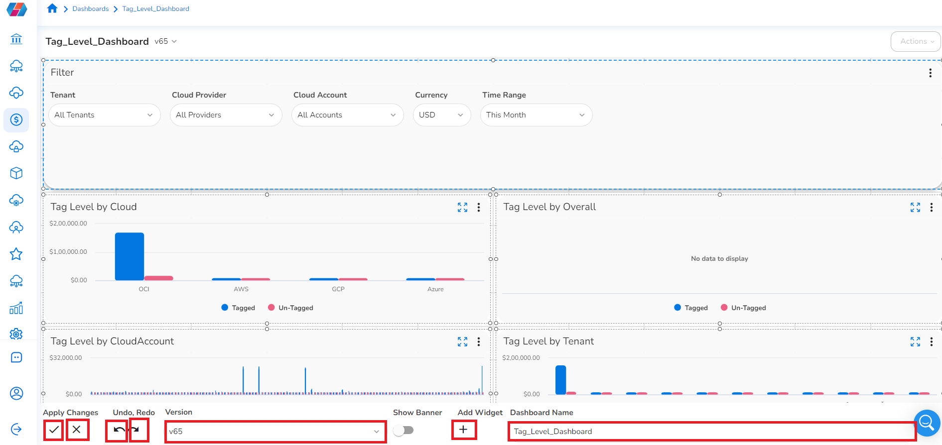
Users can perform the following actions by using the toolbar available along the bottom of the dashboard:
- To apply/save any changes in the dashboard, click the checkmark symbol.
- To discard the changes in the dashboard, click the cross symbol (X).
- To undo changes, click the Undo arrow symbol.
- To redo changes, click the Redo arrow symbol.
- In the Version list, click to select the appropriate version of dashboard.
- Click the three vertical dots at the bottom-right of the screen to do the following:
- To import a widget, click Import Widget > Upload File > select a file > click Import.
- To clear existing widgets, click Clear Widgets.
- To collapse widgets vertically, click Collapse Vertically.
- Click Show Banner to enable/disable the dashboard banner.
- Refer to Adding Banner on Dashboard for more info.
- Click + to add a new widget to the existing dashboard.
- In the Dashboard Name box, type the name of the dashboard. The existing name can be deleted and a new name can be added here.
Using the Actions List
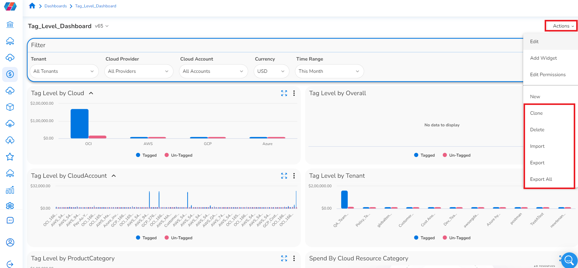
Users can select the Actions tab to expand a drop-down list of options for more additional actions that can be performed on a dashboard:
- Click Edit to update or modify an existing dashboard (Refer to Editing a Dashboard).
- Click Add Widget or New to add a new widget (Refer to Adding New Widget to a Dashboard).
- Click Edit Permissions to add permissions for a dashboard (Refer to Adding Permissions for Dashboard).
- Click Clone to create a copy of an existing dashboard.
- Click Delete to remove a dashboard (Refer to Deleting a Dashboard).
- Click Import, then Upload File > select a file > click Import to import a dashboard.
- Click Export, then Download to export a dashboard.
- Click Export All, then Download to export all dashboards.
Deleting a Dashboard
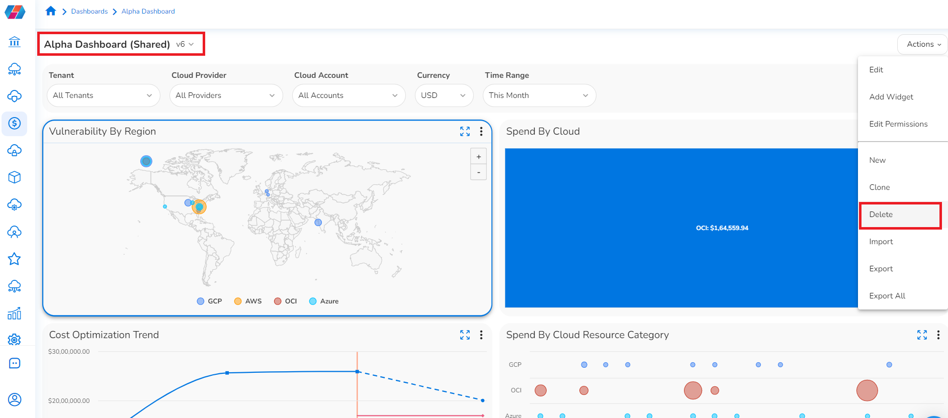
To delete a dashboard, follow the below steps:
- On the top-left corner of the screen, click the list to select a dashboard that needs to be deleted.
- In the Actions list, click Delete.
- In the Are you Sure? dialog box, click Yes.
This deletes the selected dashboard.After a dashboard is deleted, it cannot be retrieved back. Proceed with deleting a dashboard only if you are certain about it.
Adding Banners to Dashboards
Perform the following steps to add a banner to a dashboard:
-
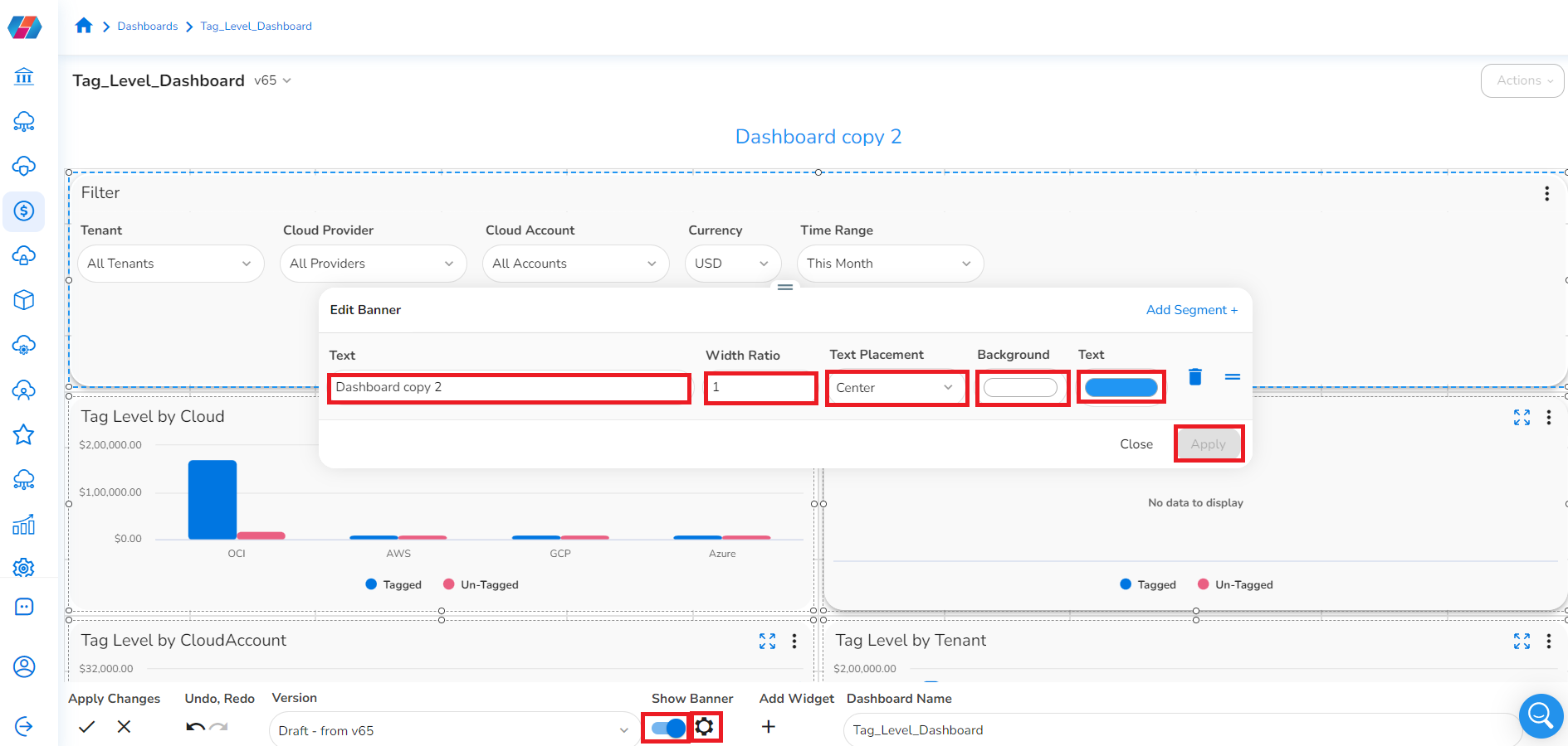
In the Show Banner field, slide the button to the right to enable the banner to be displayed.
-
Click the Settings icon (small circle icon), to perform the following settings for the banner that is displayed for the dashboard:
a. In the Text box, type the name of the dashboard.
b. In the Width Ratio box, click the up or down arrow to select the appropriate width ratio for the banner.
c. In the Text Placement list, click to select an appropriate option as per which the dashboard name will be displayed in the banner.
d. In the Background box, click the box and select the desired color for the banner.
e. In the Text box, click the box and select the desired text color for the banner text.
f. Click Apply.Note:
Click the Delete icon to delete the banner and click Add Segment > Text or Image to add the banner back.
-
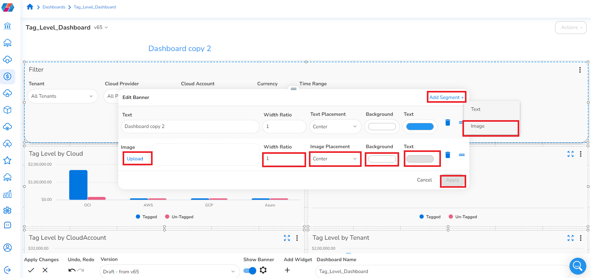
If you select Add Segment > Image, then perform the following:
a. In the Image field, click Upload, then click Upload File, and then select the image to be uploaded for the banner.
b. In the Width Ratio box, click the up or down arrow to select the appropriate width ratio for the banner.
c. In the Image Placement list, click to select an appropriate option as per which the image will be displayed in the banner.
d. In the Background box, click the box and select the desired color for the banner.
e. In the Text box, click the box and select the desired text color for the banner text.
f. Click Apply.
Editing a Widget
To make changes in an existing widget, perform the following steps:
- On the top-left side of the screen, click the list and select a dashboard.
- Click the widget where changes need to be made.
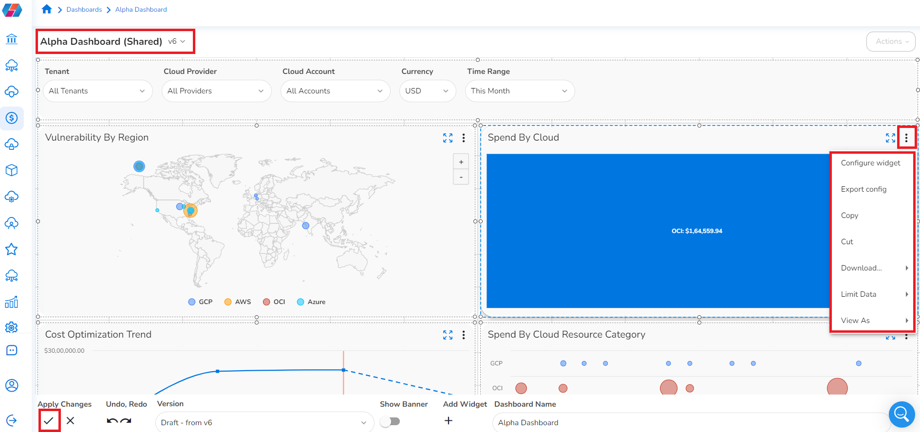
- On the top-right corner of a widget, click the three vertical dots and perform any of the following:
Configure
- To configure a widget, click Configure widget. On the Configure screen, select the relevant tab, make the changes, and click Finish. This completes widget configuration.
Note: To learn about different tabs that can be updated for various widgets, refer to Adding New Widget to a Dashboard.
Export
- To export a widget, click Export config > on Widget Export dialog box, click Download.
Copy
- To copy a widget, click Copy. To paste this copied widget, click the Actions list (on the top right side of the screen) > Edit, and then at the bottom of the screen, click the three vertical dots > Paste Widget(s). The widget is pasted at the bottom of the screen.
Cut
- To cut a widget, click Cut. To paste the widget, at the bottom of the screen, click the three vertical dots > Paste Widget(s). The widget is pasted at the bottom of the screen.
Download
- To download a widget, click Download > click to select either CSV or PNG. This downloads a widget in the selected format.
Limit Data
- To limit the data as per which the widget needs to be displayed, click Limit Data > click to select an appropriate option. The widget is displayed as per the selected option. If the chart looks very busy or occupied with details, this is a good option to make the visualization more clear.
Add New Widget
- To add a new widget in an existing grid, click Add widget > New > follow the steps in topic Adding New Widget to a Dashboard.
Import Widget
- To import a widget, click Add widget > Import > in the Widget Import dialog box, click Upload File > select a file > click Import. This imports a widget in an existing grid.
View As
- To view an existing widget in a different format, click View As > select the desired chart format. The widget is now displayed as per the selected option.
For example, in the Tagged Resources Cost By Product Category widget, click the three vertical dots > View As > Donut.
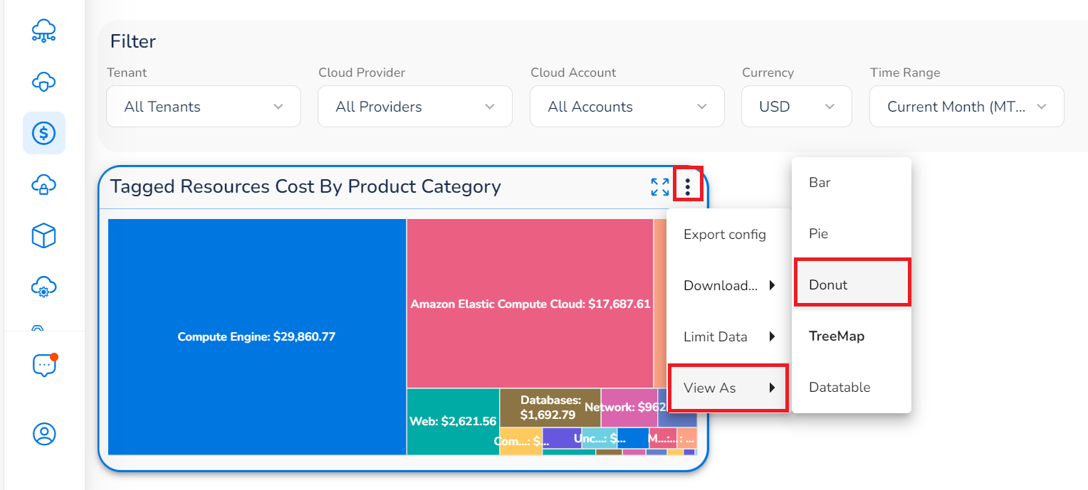
Figure 1: TreeMap Chart
The widget changes from a TreeMap chart type to a Donut chart, as shown below. To further demonstrate, if you want to change the chart type from Donut chart to Pie chart, then in the widget, click the three vertical dots > View As > Pie.
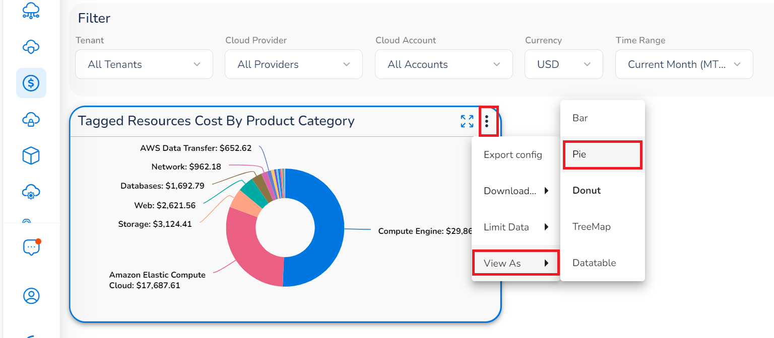
Figure 2: Donut Chart
The chart type in the widget changes to Pie chart as shown below.
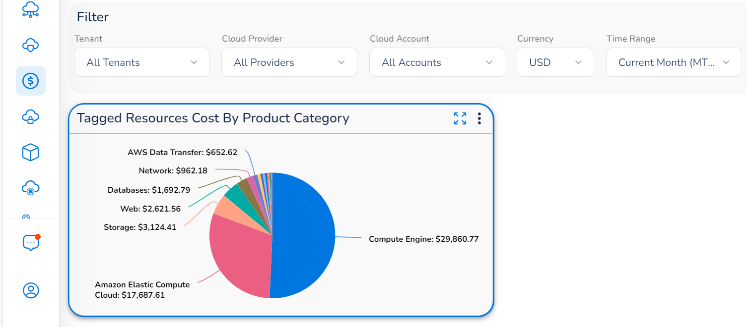
Figure 3: Pie Chart
- Click the checkmark symbol to accept the changes on the dashboard.
Deleting a Widget
A widget within a dashboard can be deleted.
To delete a widget:
- On the top-left corner of the screen, click the list to select a dashboard from where a widget needs to be deleted.
- In the Actions list, click Edit.
- Click to select the widget that needs to be deleted and press the Delete key.
- Click the Checkmark symbol (bottom left of the screen) to accept the changes in the dashboard.
Resizing or Moving a Widget
A widget can be resized or can be moved within a dashboard.
To resize or move a widget:
- On the top-left corner of the screen, click the list to select a dashboard that needs to be edited.
- In the Actions list, click Edit.
- To move a widget within a dashboard, a user can drag and drop it to a different location or to resize a widget, drag the corners and sides of a widget inwards or outwards.
- Click the checkmark symbol (bottom left of the screen) to accept the changes in the dashboard.
Adding Permissions for a Dashboard
After a dashboard is created and widgets are added, users can share a dashboard with other users. The sharing permission is enabled for a user as per their role. While sharing a dashboard with another user, the type of permission (e.g. View, Edit) and the role types (with whom the dashboard needs to be shared) should be defined.
Follow the below steps to add permissions for a dashboard:
-
On the top-left corner of screen, click to select a dashboard.
-
In the Actions list, click Edit Permissions.
-
On the Edit Permissions dialog box, click Add Permissions.

-
Click one of the following options and select relevant details in the selected option:
- Global Scope: On the Edit Entry screen, in the Select Role Types section, click to select the roles with whom the dashboard needs to be shared and in the Select Permissions section, click to select the type of action that the selected roles can take.
- Account Scope:
- On the Edit Entry screen, in the Account list, click to select an account.
- In the Select Role Types section, click to select the roles with whom the dashboard needs to be shared.
- In the Select Permissions section, click to select the type of action that the selected roles can take.
- Tenant Scope: On the Edit Entry screen, in the Tenant list, click to select a tenant and in the Select Permissions section, click to select the type of action that the selected tenant can take.
-
Click Apply.
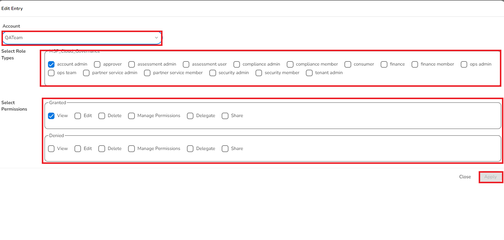
The selected user roles are given the appropriate permissions for the dashboard. These users can take appropriate actions on the dashboard as per their granted permissions.
If the existing permission for a dashboard needs to be edited or deleted, then users can do the following:
- Select a dashboard.
- Click Actions > Edit Permissions.
- In the Edit Permissions dialog box, click the Pencil icon to edit the permission or click the Delete icon to delete the permission.
- Click Update.

Types of Charts
The data in widgets can be presented in different chart formats. Users can select the available chart type while configuring a widget. Based on the chart types supported for a widget, users can select one of the available options. However, users can also edit a widget to change its chart type anytime.
Some widgets do not provide the option to select a chart type because they have a pre-defined chart type as per which the data is shown.
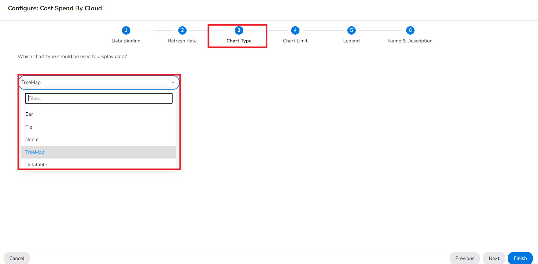
Below are some chart types that are available for widgets, for reference:
- Grouped Column
- Stacked Column
- Datatable
- Line
- Area
- Heatmap
- Bar
- Pie
- Donut
- Treemap
- Flow
- Bubble
- Sunburst
Updated about 1 year ago