

SaaS Dashboard - Cost Support
This user guide takes you through the SaaS dashboard that supports cost analysis within CoreStack.
Introduction
The SaaS Dashboard provides unified visibility into both cloud and third-party SaaS costs using the FinOps FOCUS standard. It enables enterprises to track, allocate, and analyze SaaS spend alongside cloud costs through a single Executive Dashboard experience. Automated SaaS onboarding, contextual filters, and standardized providers ensure accurate, frictionless cost governance. The solution empowers FinOps, finance, and engineering teams to improve accountability, forecasting, and ROI across total IT spend. In this guide, you will learn how to navigate the dashboard, apply filters, and customize views to optimize cost management.
View SaaS Dashboard
Perform the following steps to go through the Multi-cloud SaaS Dashboard:
1. Navigate to FinOps
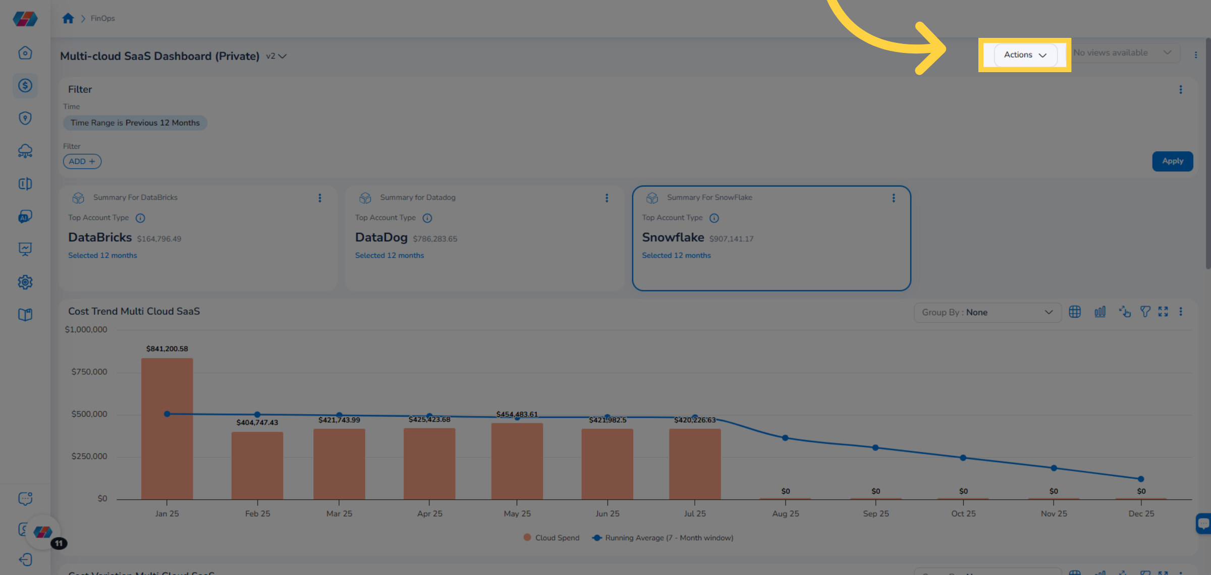
On the left navigation menu, click FinOps.
2. Click Dashboard
Click Dashboard to open the FinOps dashboard for various cost insights.
3. View Multi-cloud SaaS Dashboard
View the Multi-cloud SaaS Dashboard showcasing various widgets that supports SaaS cloud visibility.
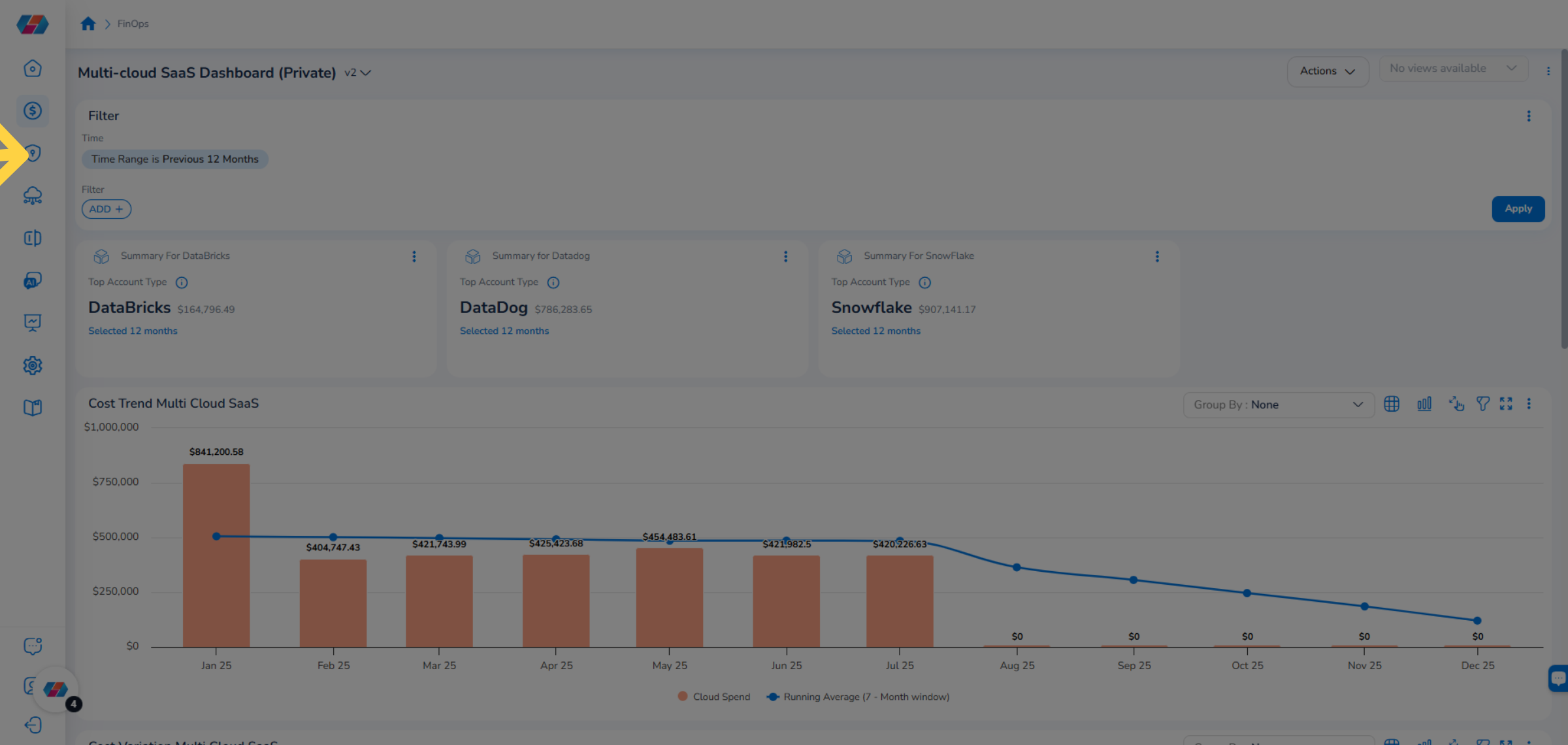
4. Global Filter
The Filter section on the top of the page shows the global filter and custom filter. Users can see the Time Range global filter.
5. Update Value For Time Range Filter
To change the value for the Time Range filter, click the drop-down, select another value, and click Ok.
6. Apply Selected Filters
Click the Apply button to update the dashboard with your chosen time range.
7. Add Custom Filter
Click Add+ to add custom filter for the dashboard.
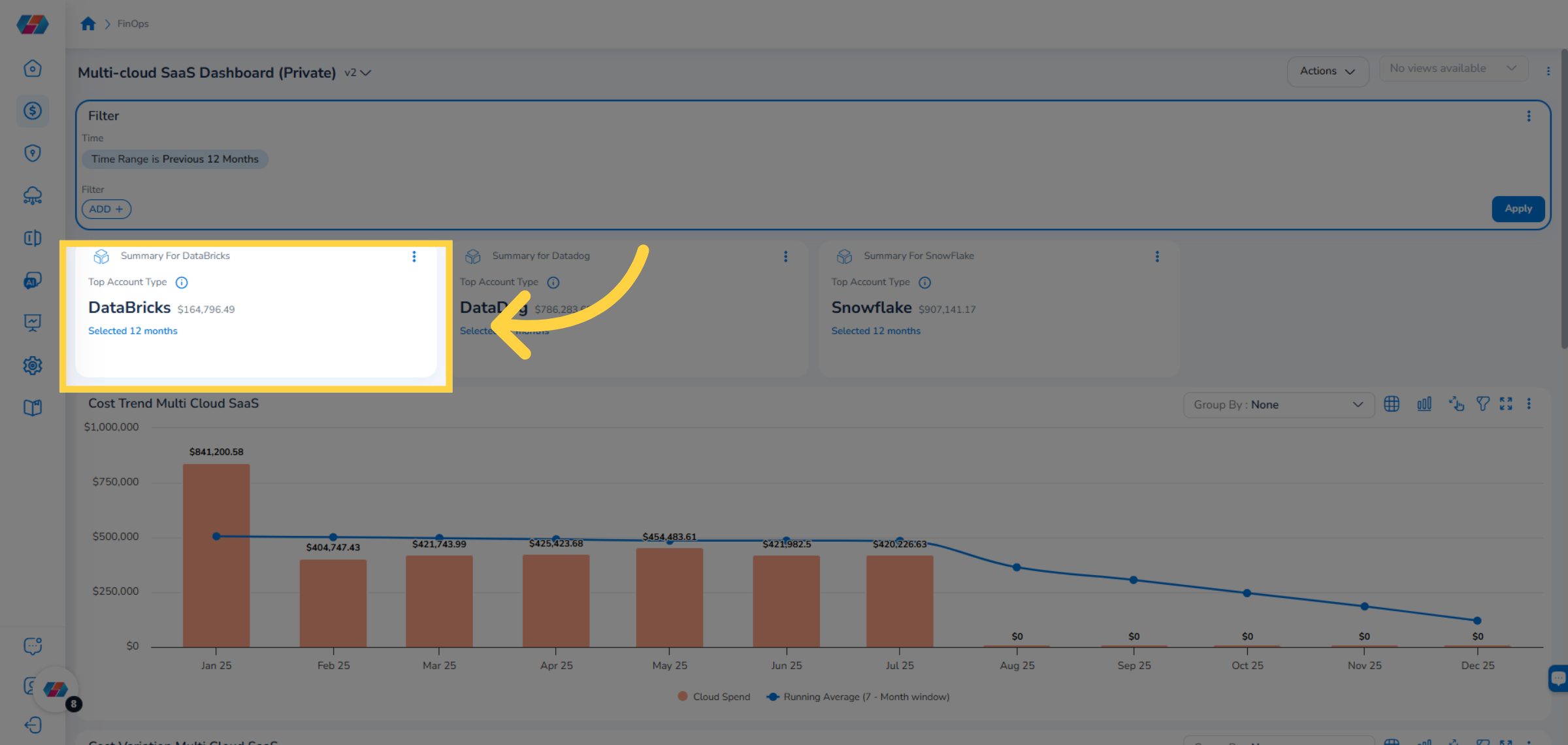
8. View Summary for DataBricks
View the Summary for DataBricks widget that shows the cost spend for the top account types for a time period. You can hover the mouse pointer over the "i" symbol to see the cost spend details.
9. View Summary for Datadog
View the Summary for Datadog widget that shows the cost spend for the top account types for a time period. You can hover the mouse pointer over the "i" symbol to see the cost spend details.
10. View Summary for SnowFlake
View the Summary for SnowFlake widget that shows the cost spend for the top account types for a time period. You can hover the mouse pointer over the "i" symbol to see the cost spend details.
11. View Cost Trend Multi Cloud SaaS
View the Cost Trend Multi Cloud SaaS widget. This widget shows month-wise cloud spend amount.
12. Select an Option for Group By Drop-down
In the Group By drop-down list, select an option to group details in the widget as per the selected option and view it.
13. View Cost Variation Multi Cloud SaaS
View the Cost Variation Multi Cloud SaaS widget. This widget shows month-wise cost variation for multi-cloud SaaS account. You can click the Group By drop-down list and group details in the widget as per the selected option.
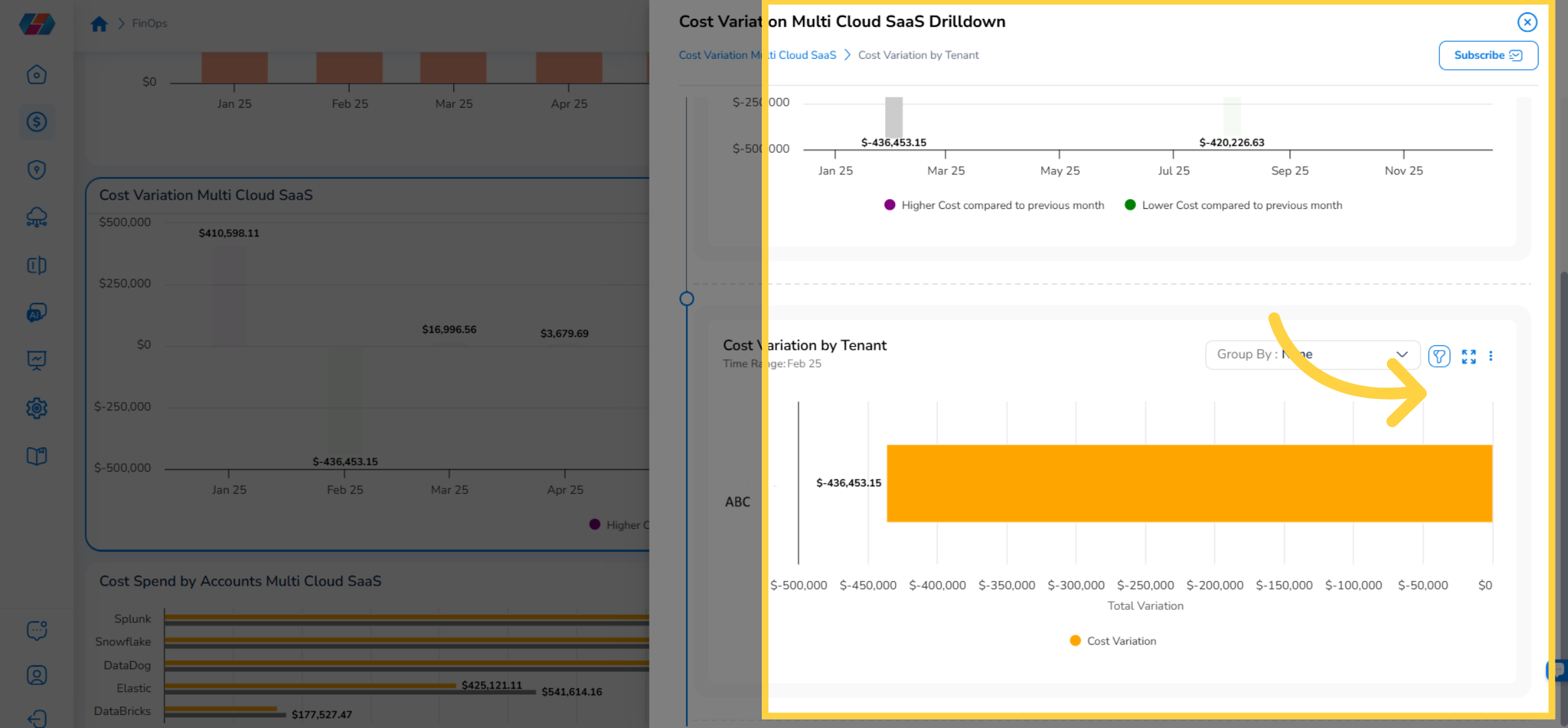
14. Click a Data-Point
Users can click on a data-point to view its drilldown details.
15. View Drilldown Details
The Cost Variation Multi Cloud Saas Drilldown screen opens and you can view the drilldown details here.
16. View Cost Spend by Accounts Multi Cloud SaaS
View the Cost Spend by Accounts Multi Cloud SaaS widget. This widget shows cost spend for multi-cloud SaaS accounts. You can click the Group By drop-down list and group details in the widget as per the selected option.
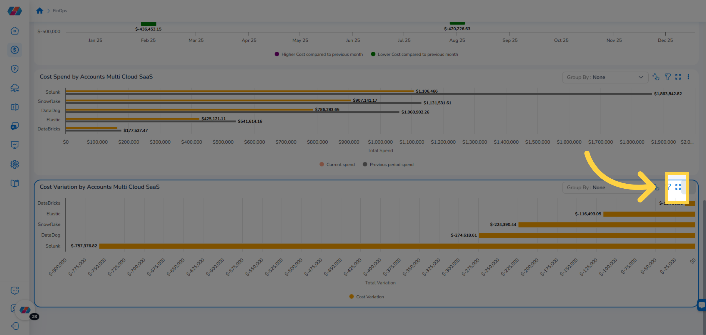
17. View Cost Variation by Accounts Multi Cloud SaaS
View the Cost Variation by Accounts Multi Cloud SaaS widget. This widget shows cost variation for multi-cloud SaaS accounts. You can click the Group By drop-down list and group details in the widget as per the selected option.
18. Click a Data Point
On the widget, click a data-point to view the drilldown details.
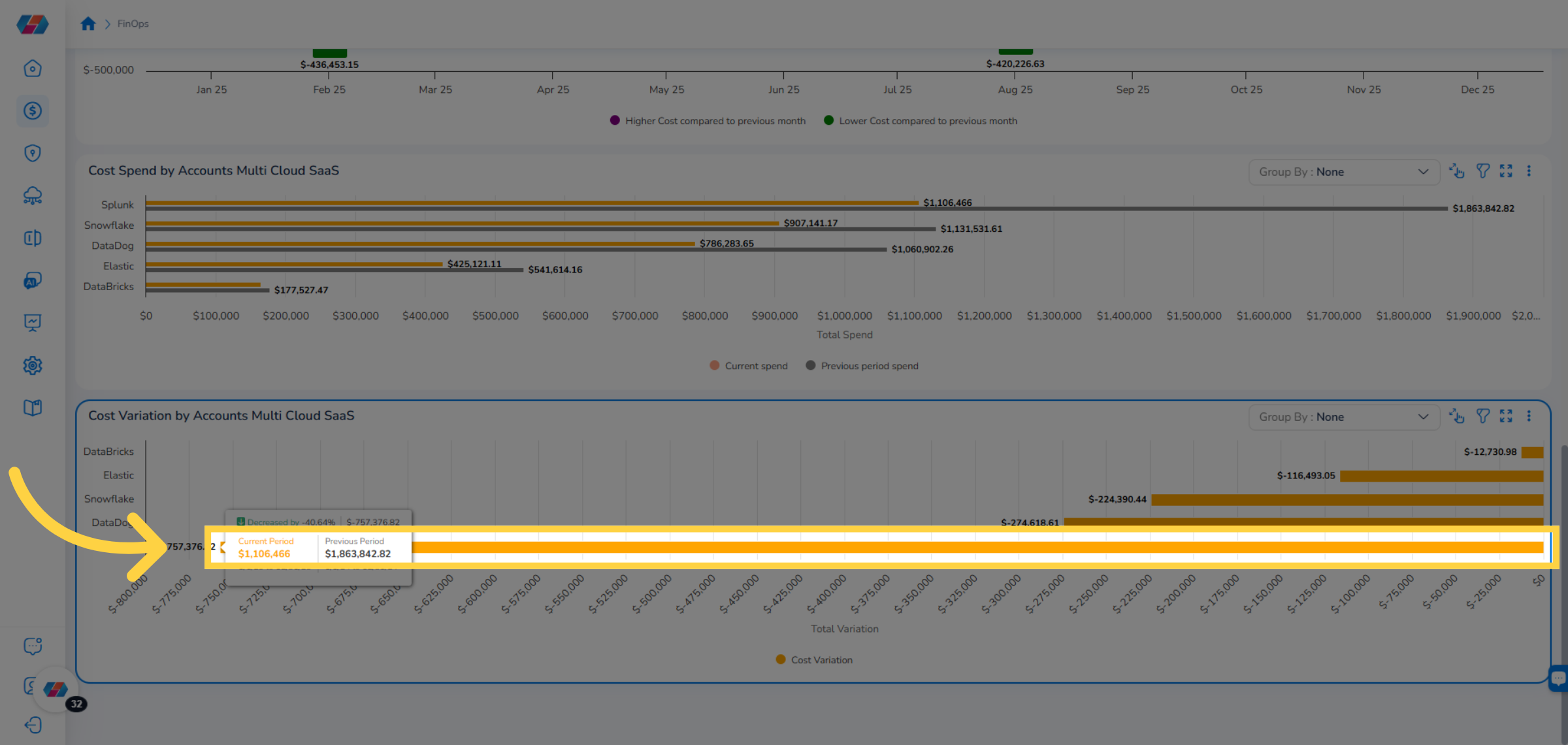
19. View Drilldown Details
The Cost Variation By Accounts Multi Cloud SaaS Drilldown screen appears where users can view the drilldown details.
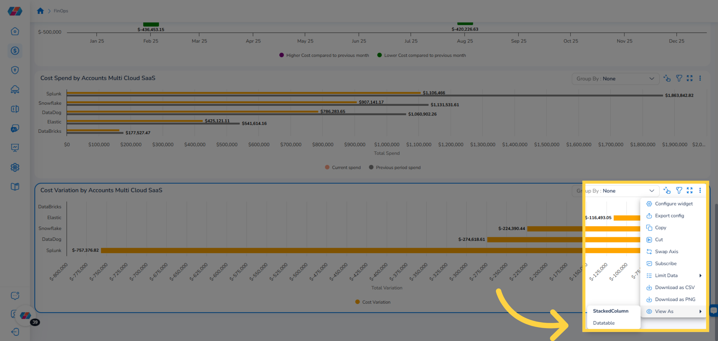
20. Action on Widget
In the drilldown screen, in the drilldown widget, click the ellipses and select a relevant action.
21. Subscribe
To receive scheduled emails regarding cost spend, click Subscribe located on the top-right corner of the screen and fill the details in the form. Users will receive emails as per the selected frequency.
22. Maximize the Widget View
Click here to maximize the widget view and click it back to get back to the original view.
23. View As Feature
To view the widget in a different chart format, click the ellipses, click View As, and select another chart type.
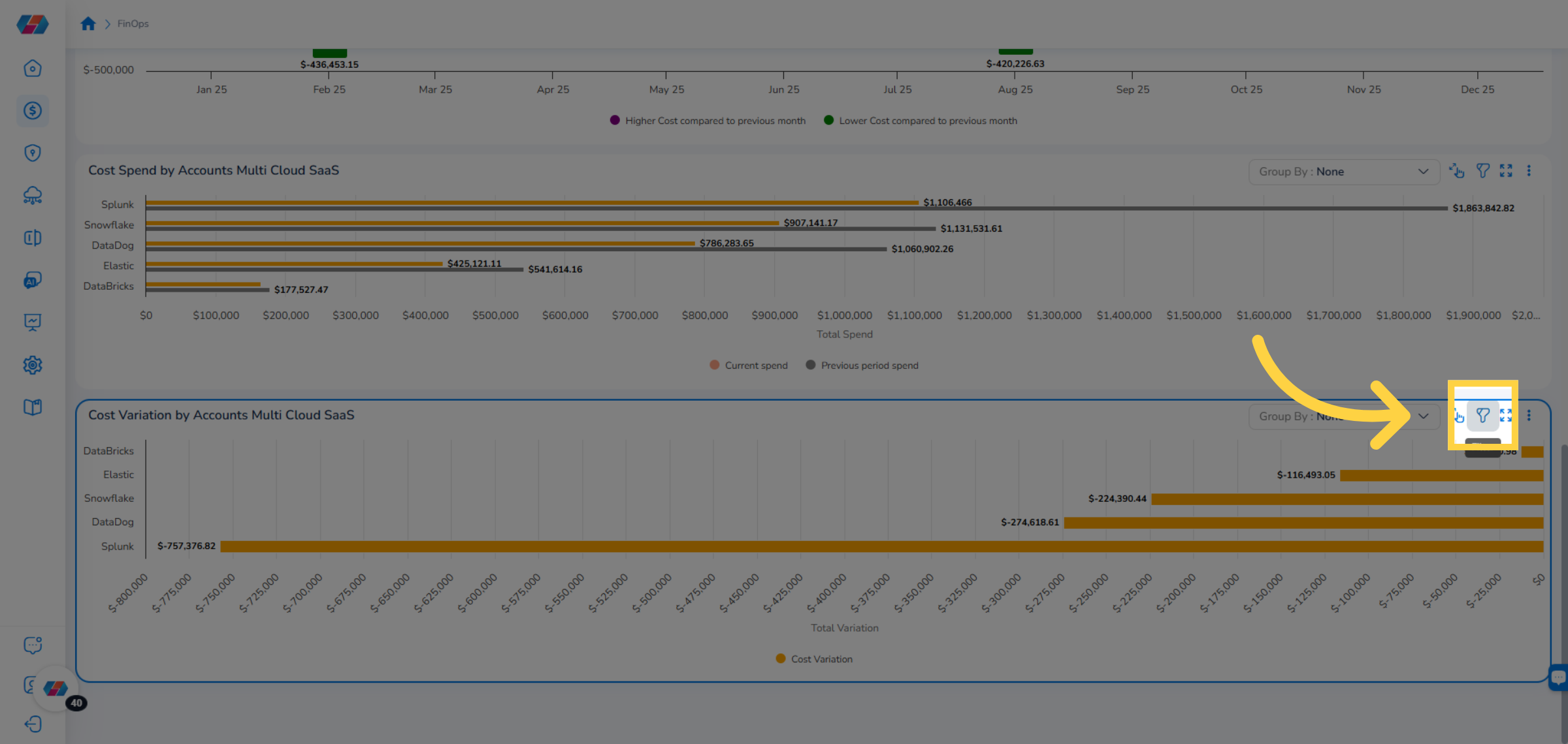
24. View/Hide Filter
Click the Filter icon to view or hide the available filters for the widget.
25. Add New Filter
To add a custom filter, click ADD+.
26. Select Account Status Filter
Click to select a filter. For example, in this case, select the Account Status filter to specify which account statuses to include.
27. Add Values for the Filter
Click the drop-down list and select applicable option(s) for the filter.
28. Click Ok
Click Ok to apply the selected values for the filter.
29. View the Time Range Filter
View the Time Range filter which is the global filter. Users can change the values for it.
30. View Widget in Tabular Format
Select the Tabular View icon to view the details of the chart in tabular format.
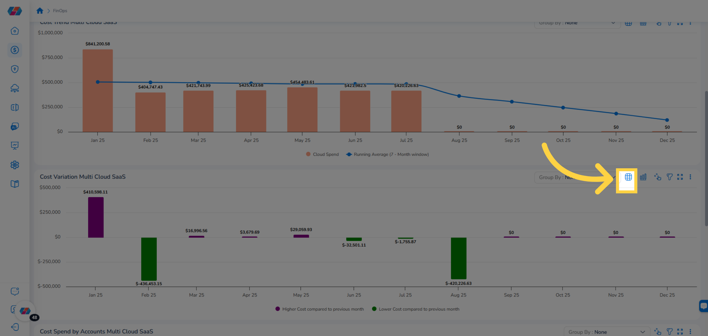
31. View Widget in Chart Format
Select the Chart View icon to view the details of the chart in graph format.
32. Take an Action
Users can click the Actions drop-down list and select an option to take a relevant action on the widget or dashboard.
Updated 6 months ago