

Cost Anomaly Dashboard Deep Dive
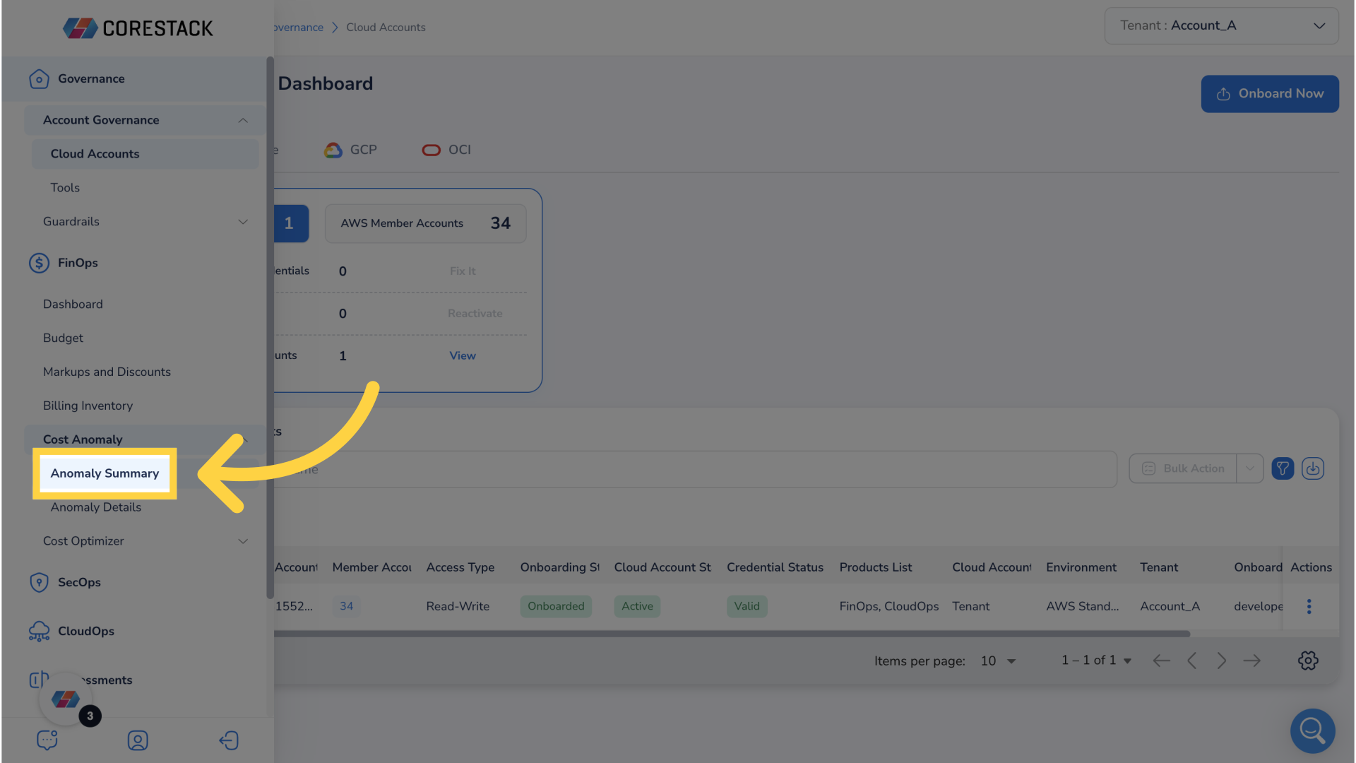
1. Click "FinOps"
Begin by navigating to FinOps.
2. Click "Cost Anomaly"
Next, click Cost Anomaly.
3. Click "Anomaly Summary"
Then, select Anomaly Summary to arrive at the Anomaly Dashboard
4. Click "Time Filter"
After arrival to the Anomaly Dashboard notice that there a plethora of filters to help narrow down data.
5. Click "Time Filter"
One example is the time filter. Click the time filter.
6. Select Drop Down Menu
Click the drop down menu.
7. Select "Previous 3 Months"
Select Previous 3 Months.
8. Click "Ok"
Finalize the selection by clicking Ok.
9. Click "Selected 90 days"
To open a drill down menu to analyze total cloud spend over the last 90 days click on selected 90 days in the total cloud spend widget.
10. Click "filter icon"
To view and apply additional filters click filter icon.
11. Click "bar"
To drilldown for further analysis click a bar on the bar graph.
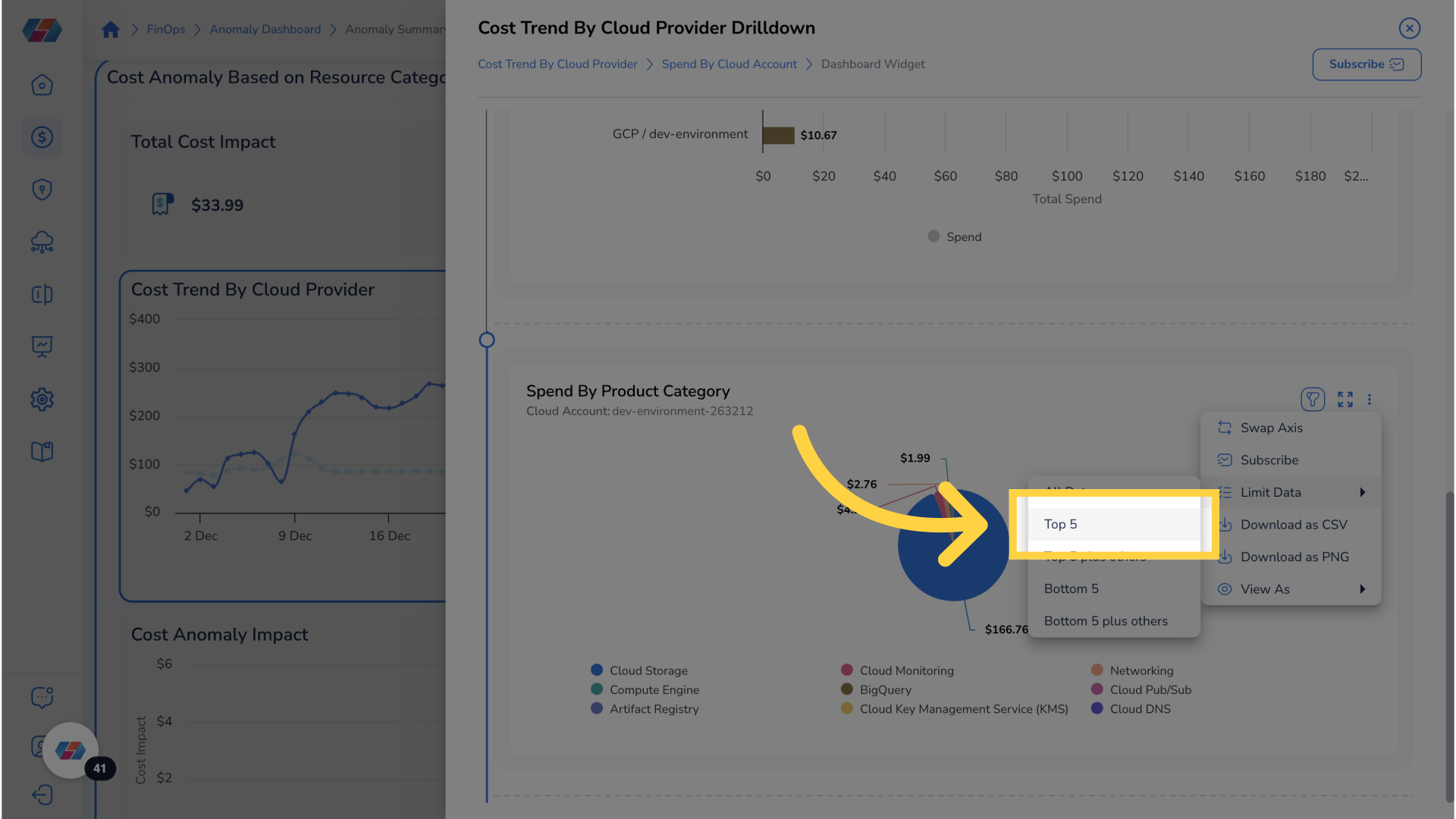
12. Click "ellipses"
Click on ellipses to see more options.
13. Click "Top 5"
Select top 5 to limit data and make chart clearer.
14. Click Bar
To drill down for even further analysis click bar.
15. Click "ellipses"
Click on ellipses for more options.
16. Click "Top 5"
Limit data to top 5 for clearer visualization and easier interpretation.
17. Click "Subscribe"
To subscribe to notifications click subscribe.
18. Click "box"
Provide a name for the subscription.
19. Fill "Subscription Name"
Fill in "TotalCloudSpend"
20. Click "Add Email address"
Next, provide an Email address for notifications.
21. Fill "Add Email Address"
Enter "[email protected]" in the provided field
22. Click "Add"
Make sure to add the Email address.
23. Click "Select Option"
Select preferred notification option.
24. Click "Once"
Choose the frequency of notifications.
25. Click "Create"
Create the subscription.
26. Click "X"
To exit the drill down menu click the x button.
27. Scroll Down To Cost Trend By Cloud Provider
Return to Cost Anomaly Dashboard and scroll down to cost trend by cloud provider widget.
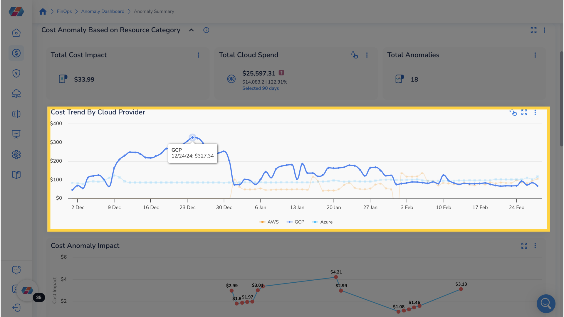
28. Click "Point On Graph"
To drill down further on cost trend by cloud provider click on any point on the graph.
29. Click "filter icon"
To view and apply additional filters click filter icon.
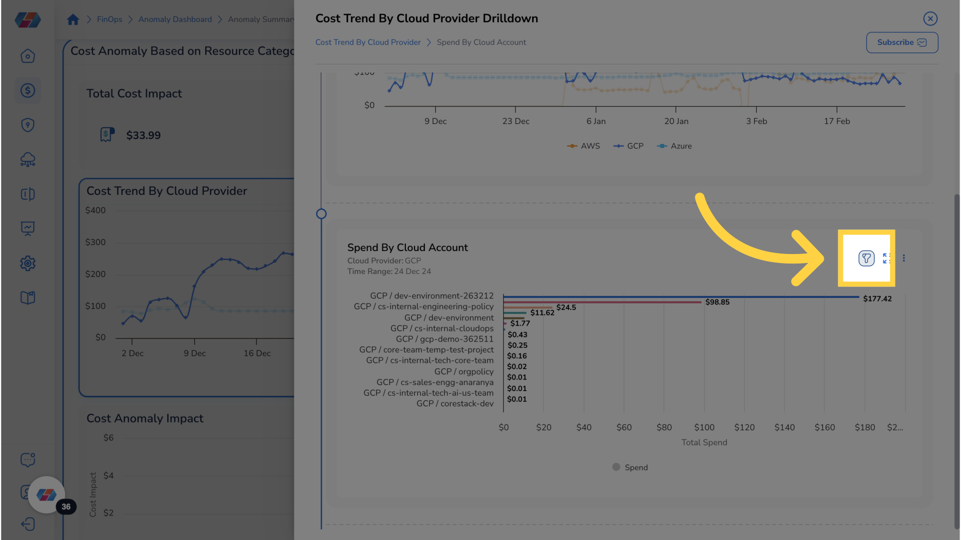
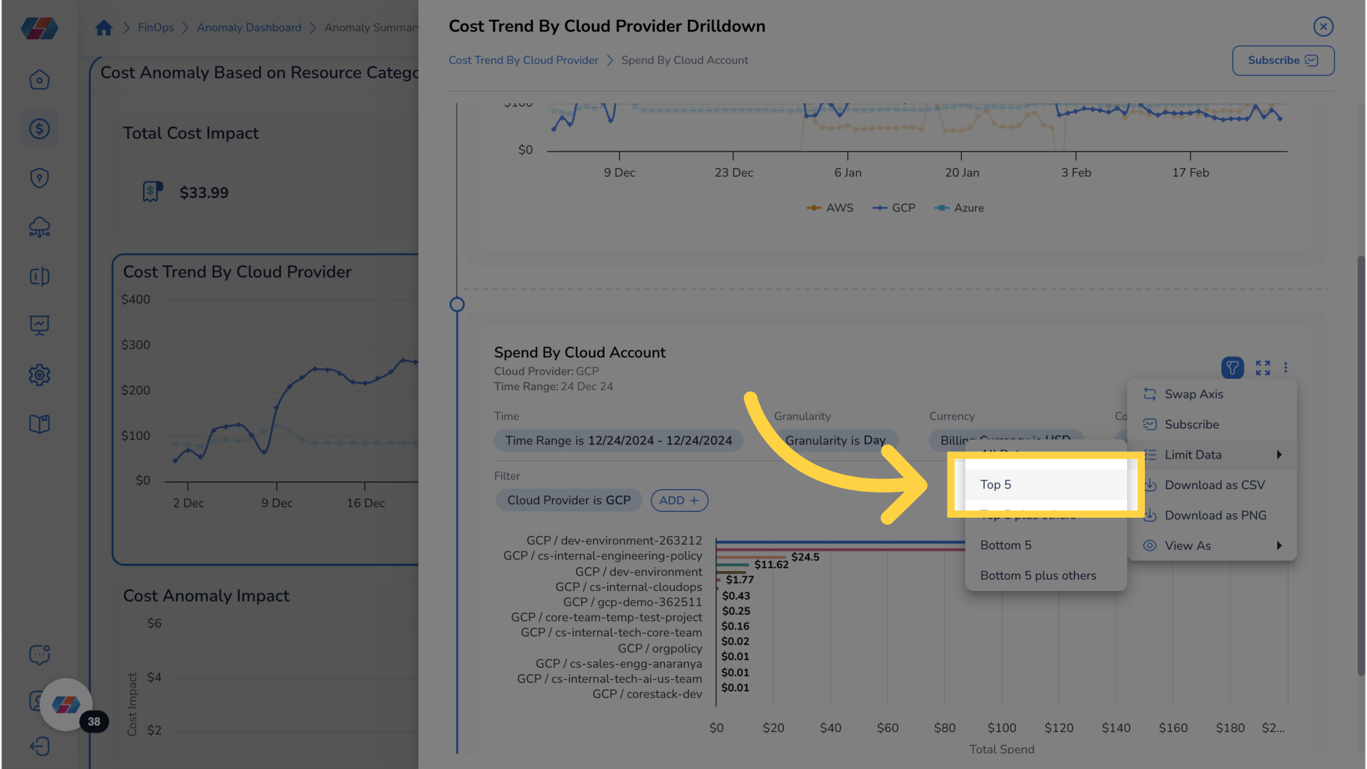
30. Click "ellipses"
Click on ellipses for more options.
31. Click "Top 5"
Limit data to top 5 for clearer visualization and easier interpretation.
32. Click "bar"
To drill down for further analysis click on bar.
33. Click "ellipses"
Click on ellipses for more options.
34. Click "Top 5"
Limit data to top 5 for clearer visualization and easier interpretation.
35. Click "Subscribe"
To subscribe for notification click subscribe
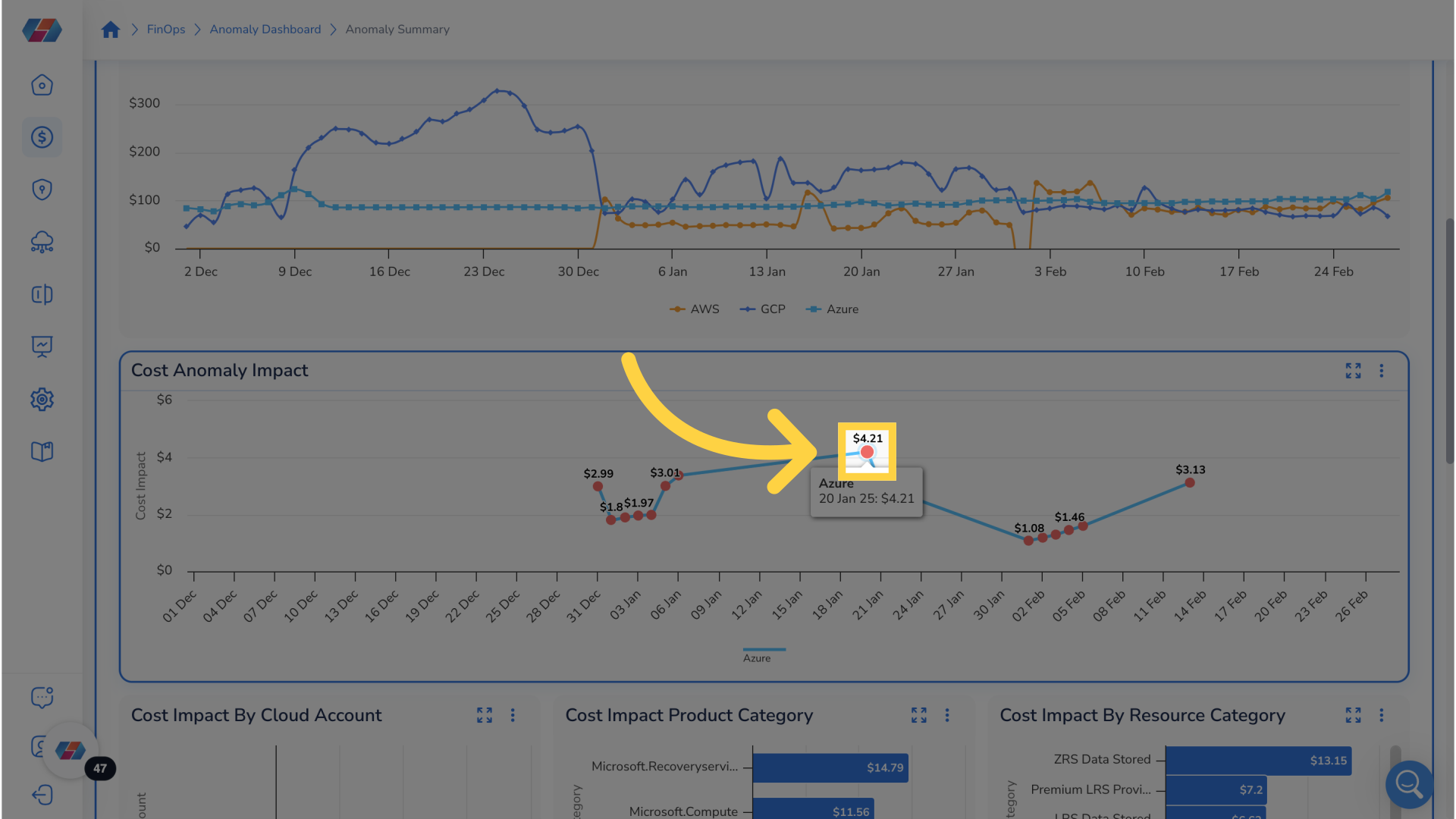
36. Navigate to Cost Anomaly Impact Widget On Cost Anomaly Dashboard
Navigate to the cost anomaly impact widget found on cost anomaly dashboard. This widget shows cost impact over a period of time. The red dots represent detected cost anomalies.
37. Click "Red Dot"
For more details regarding detected anomaly click on red dot.
38. Arrive at Cost Anomaly Detail
On this page it is possible to see more details regarding the detected anomaly.
39. Click "Resource Category"
For more detailed analysis, click on the resource category of specific anomaly.
40. Arrive at Detailed Analysis
On this page it is possible to see a detailed analysis for a resource category to better analyze anomalies.
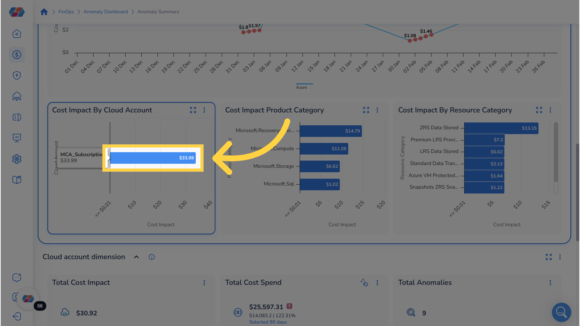
41. Navigate to Cost Impact Widgets On Cost Anomaly Dashboard
Navigate back to the cost anomaly dashboard and scroll down to cost impact widgets. These three widgets display cost impact by cloud account, by product category, and by resource category respectively.
42. Click "Bar"
To see more detailed analysis, click on the bar.
43. Click "Resource Category"
For a more detailed analysis click on the resource category for specific anomaly.
44. Arrive at Detailed Analysis
On this page it is possible to see a detailed analysis for a resource category to better analyze anomalies.
45. Navigate to Total Cost Spend On Cost Anomaly Dashboard
Navigate back to the cost anomaly dashboard and scroll down to the Total Cost Spend widget.
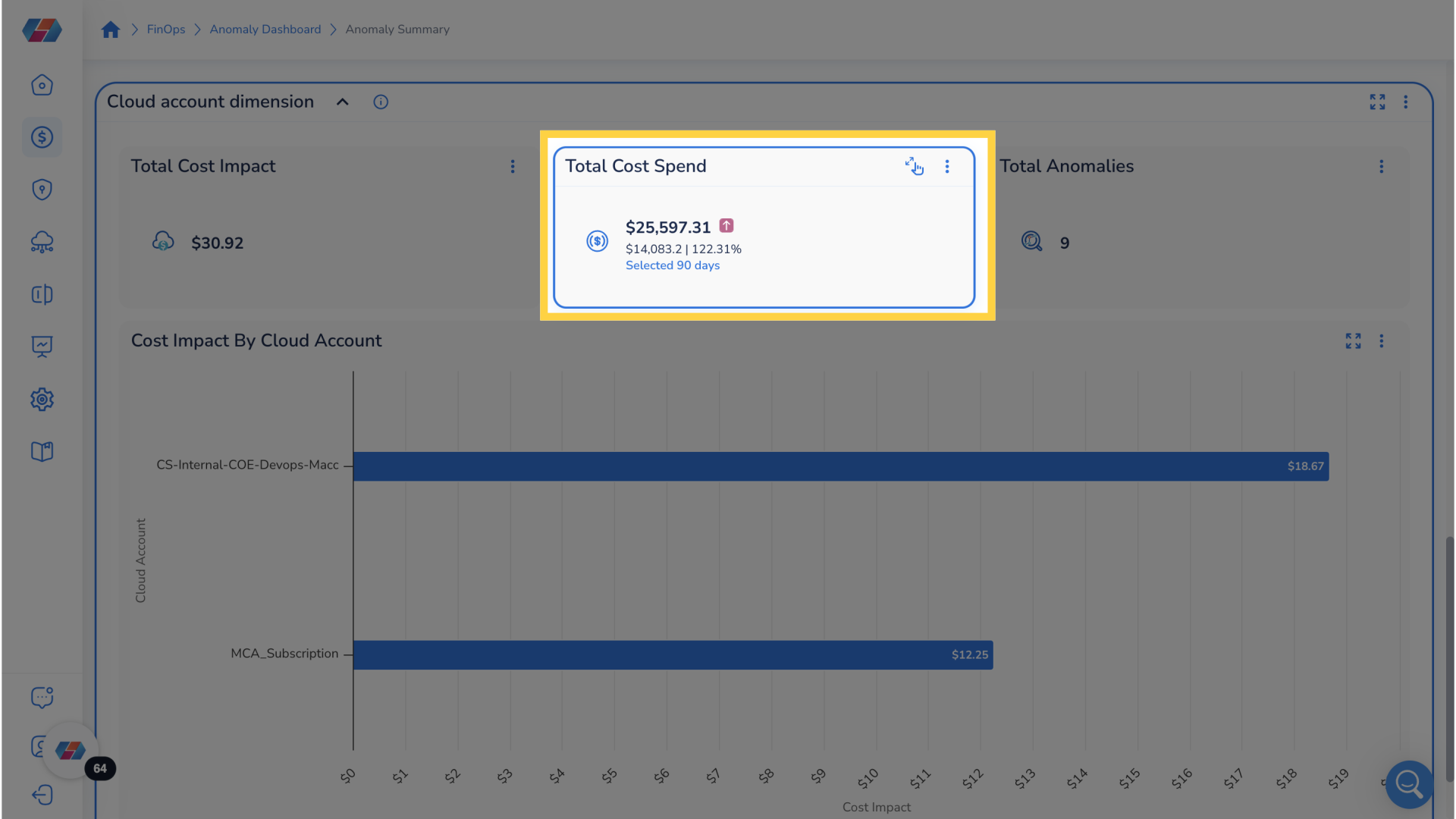
46. Click "Selected 90 days"
To open a drill down menu to analyze total cost spend over the last 90 days click on selected 90 days in the total cost spend widget.
47. Click "filter icon"
To view and apply additional filters click filter icon.
48. Click "bar"
To drill down for further analysis click bar.
49. Click "ellipses"
Click on ellipses for more options.
50. Click "Top 5"
Limit data to top 5 for clearer visualization and easier interpretation.
51. Click "subscribe"
Click subscribe to subscribe for notifications.
52. Return To Dashboard and Find Cost Impact By Cloud Account
Return to dashboard and find cost impact by cloud account.
53. Click "bar"
To drill down for further analysis click bar.
54. Click "Resource Category"
For a more detailed analysis click on the resource category for specific anomaly.
55. Arrive at Detailed Analysis
On this page it is possible to see a detailed analysis for a resource category to better analyze anomalies.
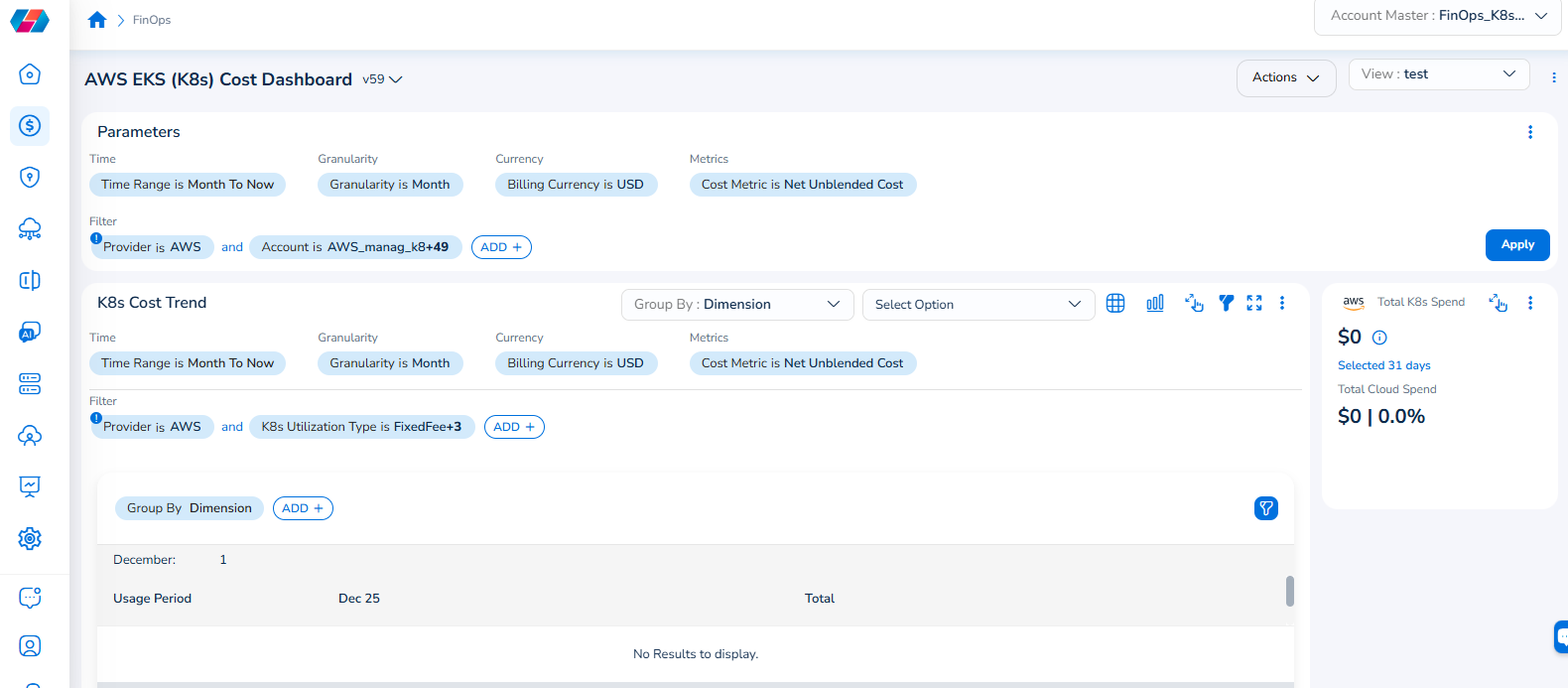
Note that the Cloud Account filter has been renamed to Account, and the Cloud Provider filter has been renamed to Provider.
For example, if you see the dashboard shown in the screenshot below, the Parameters > Filter section shows the Provider filter for which the value selected is AWS.
To add the Account filter, users can click ADD+ and select Account. In the drop-down list that appears, users can select all applicable values, and click Ok. Details will be displayed in widgets as per the selected filter(s).
In every widget that is available within a dashboard, users can click the Filter icon that appears on the top-right side of the widget and view the pre-defined filters. The Provider filter appears as a pre-defined filter. Users can use the ADD+ option to add custom filters and they have the option to add the Account filter from here.
Updated 7 months ago